When it comes to creating a soothing, sophisticated atmosphere in your home, few colours do the job as beautifully as pale blue. Farrow & Ball, known for their exceptional craftsmanship and timeless hues, offers a stunning range of pale blue shades that can transform any room into a tranquil haven. Whether you’re looking to create a coastal-inspired living room, a serene bedroom, or simply add a touch of elegance to your space, these soft blues bring a sense of calm and understated charm to your interiors.
In this post, I’m sharing some of my favourite Farrow and Ball pale blue colours. These lovely hues are perfect for achieving that light, airy, and peaceful ambience.
Get a Free Farrow and Ball Colour Card Here
Borrowed Light
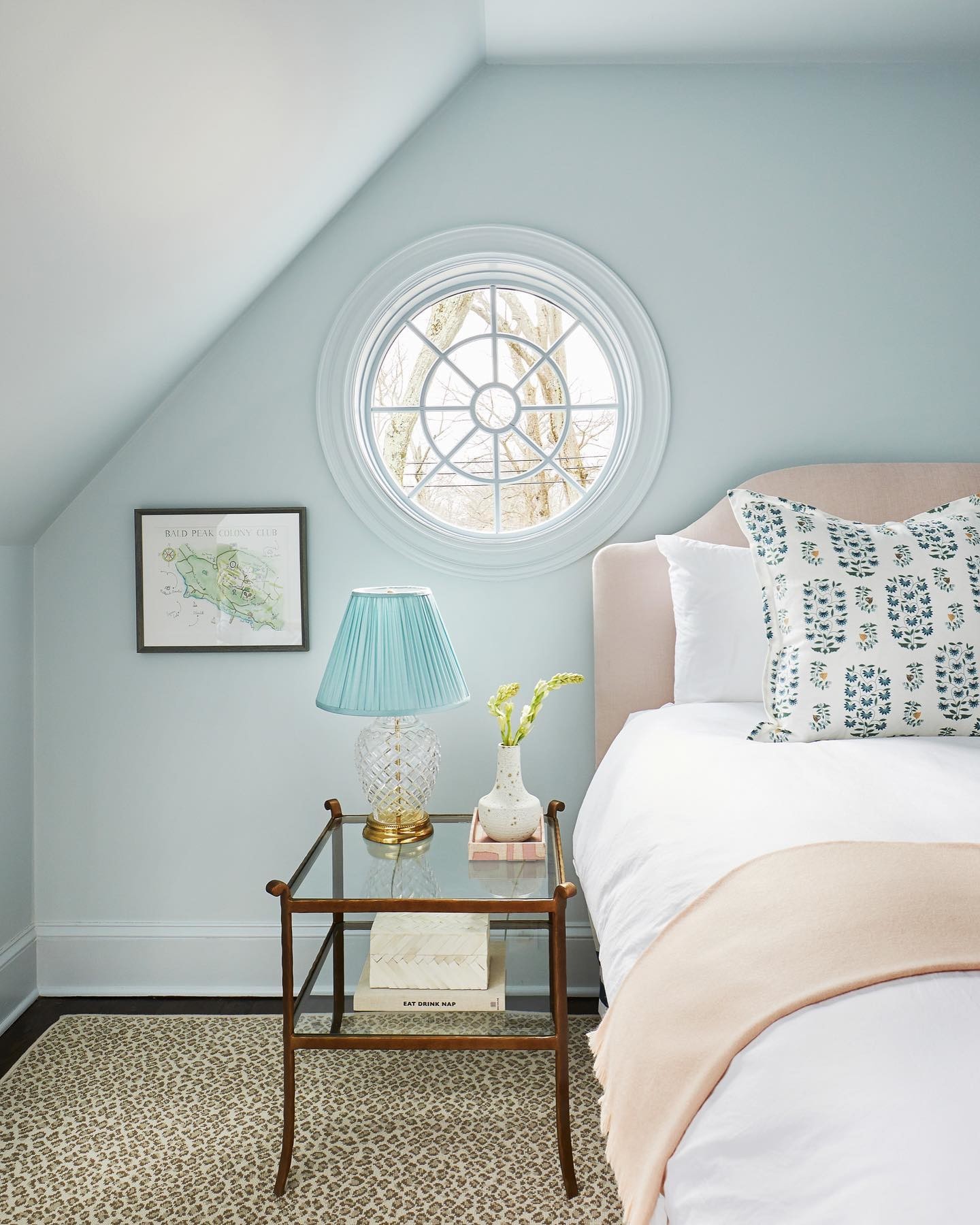
Design by @anniedelaportedesigns | Photography by @kelseyannroseinteriors | Styling by @lenabedoyan
Borrowed Light is without a doubt my favourite Farrow and Ball pale blue colour. Its delicate, ethereal blue tones work wonderfully in rooms with plenty of natural light, mimicking the soft sky on a clear day. This colour has a freshness that feels both uplifting and gentle, making it ideal for bedrooms, bathrooms, or any space where you want to create a light, airy feel. I actually painted the master bedroom in my old house in Borrowed Light, and it always felt so tranquil and peaceful. Borrowed Light pairs beautifully with crisp white trims and can add a subtle splash of colour without overwhelming the room.
Get a Sample or free Colour Card Here
Skylight
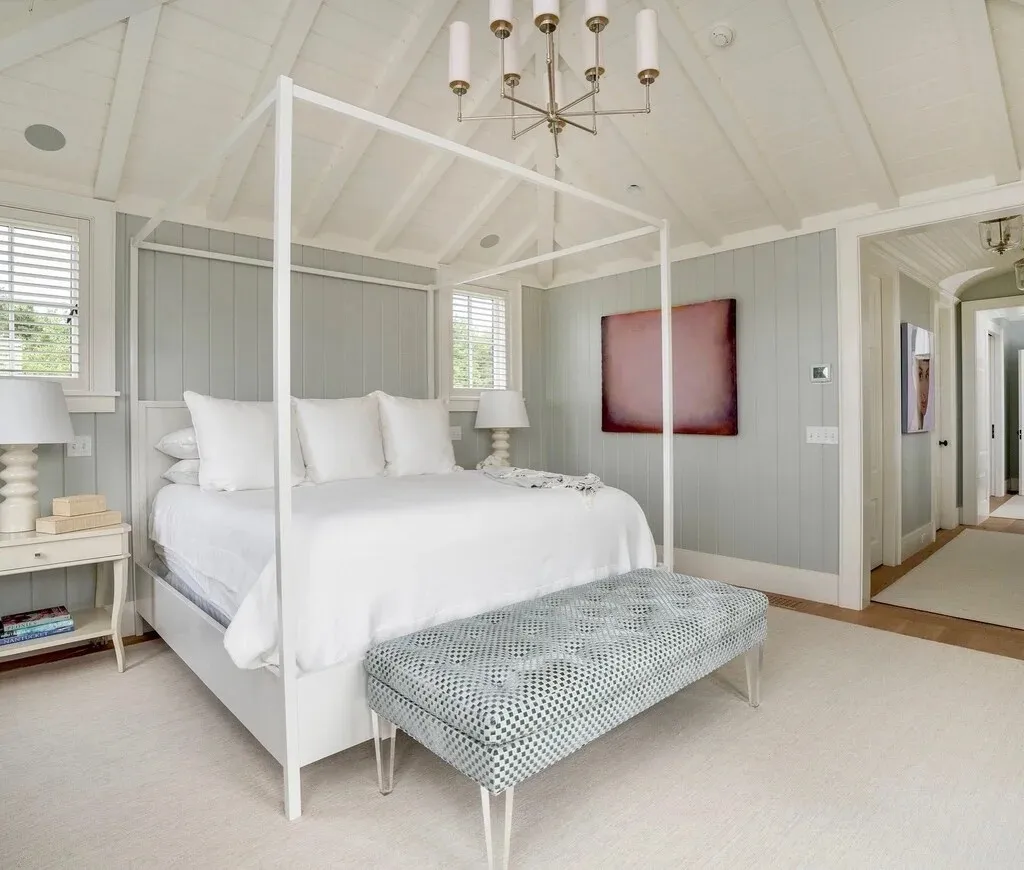
Image via Farrow and Ball by @bradfordlowryinteriors
If you’re looking for a slightly cooler pale blue, Skylight is an excellent choice. It’s a versatile colour that works particularly well in modern interiors, bringing a crisp, clean look to kitchens, bathrooms, and living areas. The subtle blue-grey tones of Skylight help to ground the space, making it a calming option that still feels refined. This shade works exceptionally well when paired with cooler tones like soft greys or crisp whites.
Get a Sample Here
Light Blue

Image via Farrow and Ball
As its name suggests, Light Blue is a soft and muted blue. It also has slight Silvery tones, giving it a more peaceful feel. It’s a wonderful colour for bedrooms, but it can also bring a refreshing vibe to kitchens or hallways. Light Blue has an almost vintage quality, making it perfect for homes with a traditional or cottage-style aesthetic. Paired with Farrow & Ball’s School House White, it creates a calm and welcoming space.
Pavilion Blue
Design by @leandrafsinteriors
For a subtle hint of sophistication, Pavilion Blue offers a pale, airy tone that feels more classic than contemporary. With a faint green undertone, this colour evokes the tranquillity of stately homes and elegant parlours. This makes it perfect for more formal sitting rooms or dining rooms. Its light, cool quality makes it a wonderful contrast to dark wood furniture or rich fabrics. It works beautifully in sun-filled rooms where the natural light enhances its subtle colour shifts.
Get a Sample Here
Hazy
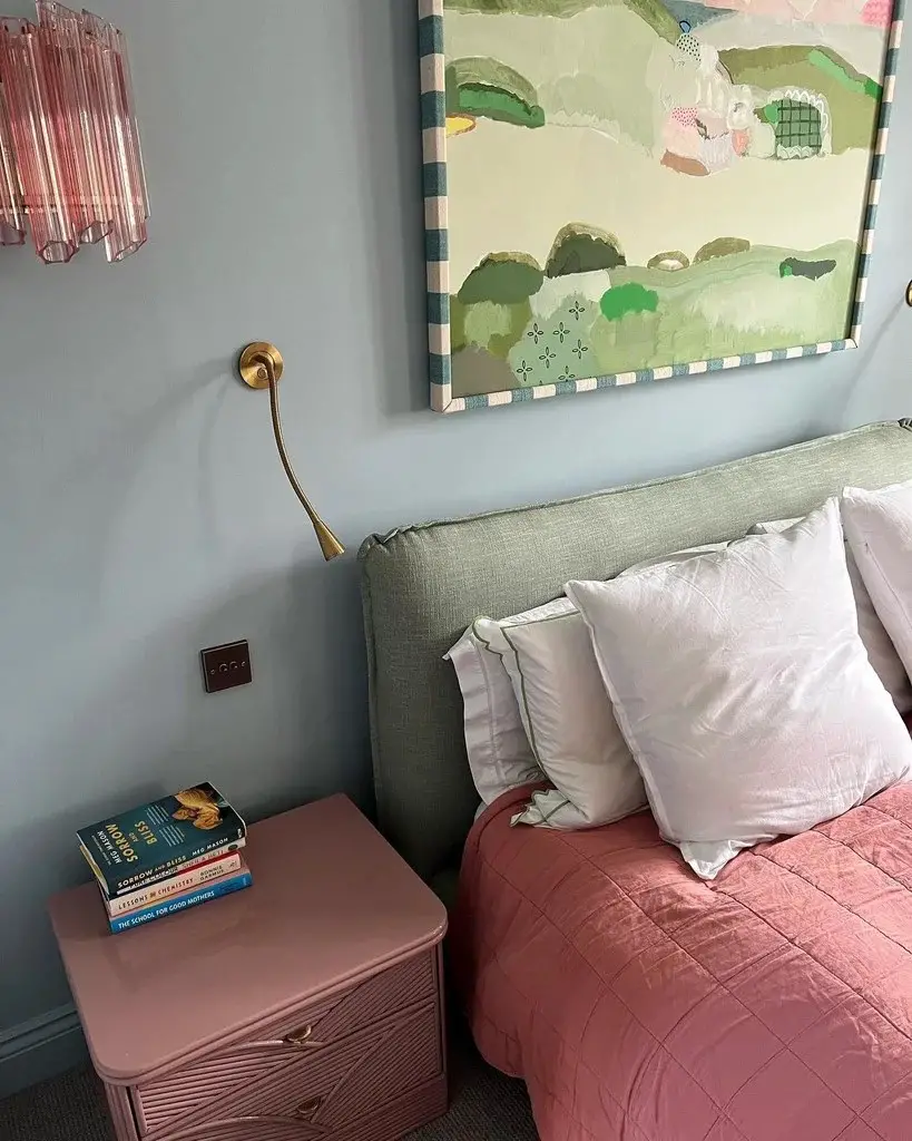
Image via @erica_davies
Hazy is one of Farrow and Ball’s newest additions to their collection, offering a serene and misty blue-grey hue that evokes the softness of an early morning fog. This gentle, muted shade is perfect for creating a calm, understated atmosphere in any room. Hazy works beautifully in both traditional and contemporary spaces, bringing a sense of tranquillity that makes it ideal for bedrooms, bathrooms, or living rooms. Its subtle grey undertones give it a sophisticated edge, making it versatile enough to pair with neutrals, darker blues, or even soft pinks. Whether you’re looking to create a quiet retreat or simply add a soothing touch to your home, Hazy is a colour that embodies effortless elegance.
Get a Sample or a Free Colour Card Here
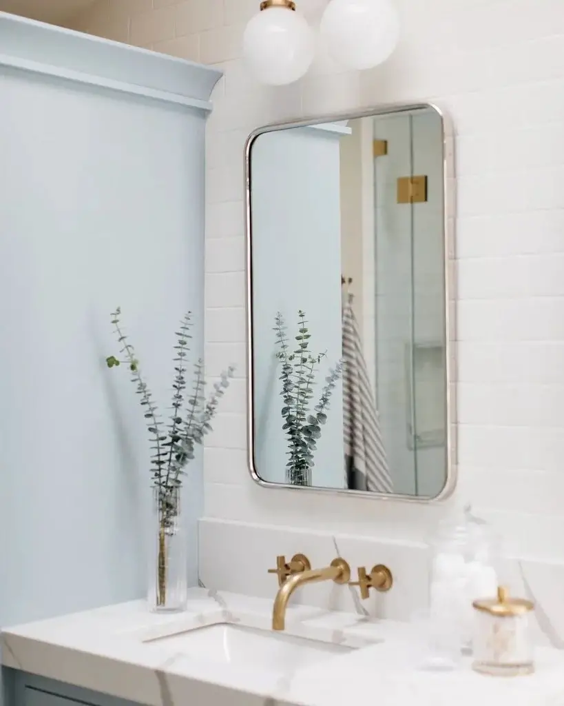
Image: Farrow and Ball via @nookandfind
Why Choose a Farrow and Ball Pale Blue?
Farrow and Ball’s paint colours are renowned for their depth and richness. Their shades of pale blue are no exception, offering nuanced hues that change with the light, giving your room a dynamic quality. Whether you’re looking to create a bright, open space or a soft, serene atmosphere, these blues can easily adapt to both traditional and contemporary interiors.
Each of these colours is crafted with Farrow and Ball’s eco-friendly, water-based paints. They are known for their long-lasting finish and low VOC content, ensuring that your space not only looks beautiful but is also better for the environment.
Get a Free Farrow and Ball Colour Card Here
The Colour Psychology of Pale Blue
Pale blue is often associated with feelings of calm, peace, and tranquillity. In colour psychology, it’s considered a soothing and serene colour that can help reduce stress and promote relaxation. This makes it a popular choice for spaces like bedrooms and bathrooms where a peaceful atmosphere is desired. Pale blue also symbolises clarity and openness, evoking the endless sky or a calm sea, which can bring a sense of freedom and spaciousness to a room. Its cool undertones make it refreshing and revitalising, helping to create a balanced, harmonious environment.
Final Thoughts
Farrow and Ball’s pale blue shades offer the perfect balance of tranquillity and sophistication. Whether you’re looking to refresh a single room or transform your entire home, these hues provide a timeless, versatile backdrop that will enhance any space. From the delicate Borrowed Light to the more playful Blue Ground, there’s a pale blue for everyone.
Want to learn more bout interior design? Check out some of the best interior styling courses here.
Leave a Reply