Pastel paint colours can often be overlooked, with people opting to either go bold and dramatic with their interiors or subtle and minimal with neutral shades. However, pastel colours are extremely versatile and make a great colour choice if you want to add a pop of colour to your setting in an understated but stylish fashion. From pink and yellow to green and blue, pastels are close to neutrals but with a vast range of colours to choose from. They tend to be pale shades on the softer side, but can also be richer in colour allowing you to make a statement with your pastel-coloured walls.
A pastel colour palette can bring a soothing vibe to a busy room, however, pastel colours are far from boring. Below I have chosen 14 pastel paint choices which are perfect if you are wanting to enrich your home with a more simple aesthetic, which isn’t limited to barely-there colour choices. Eye-pleasing pastels are oh-so subtle, but still ooze charm and character.
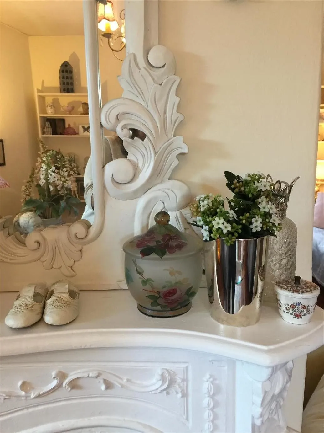
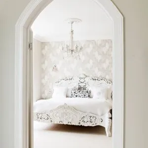
Middleton Pink, Farrow & Ball
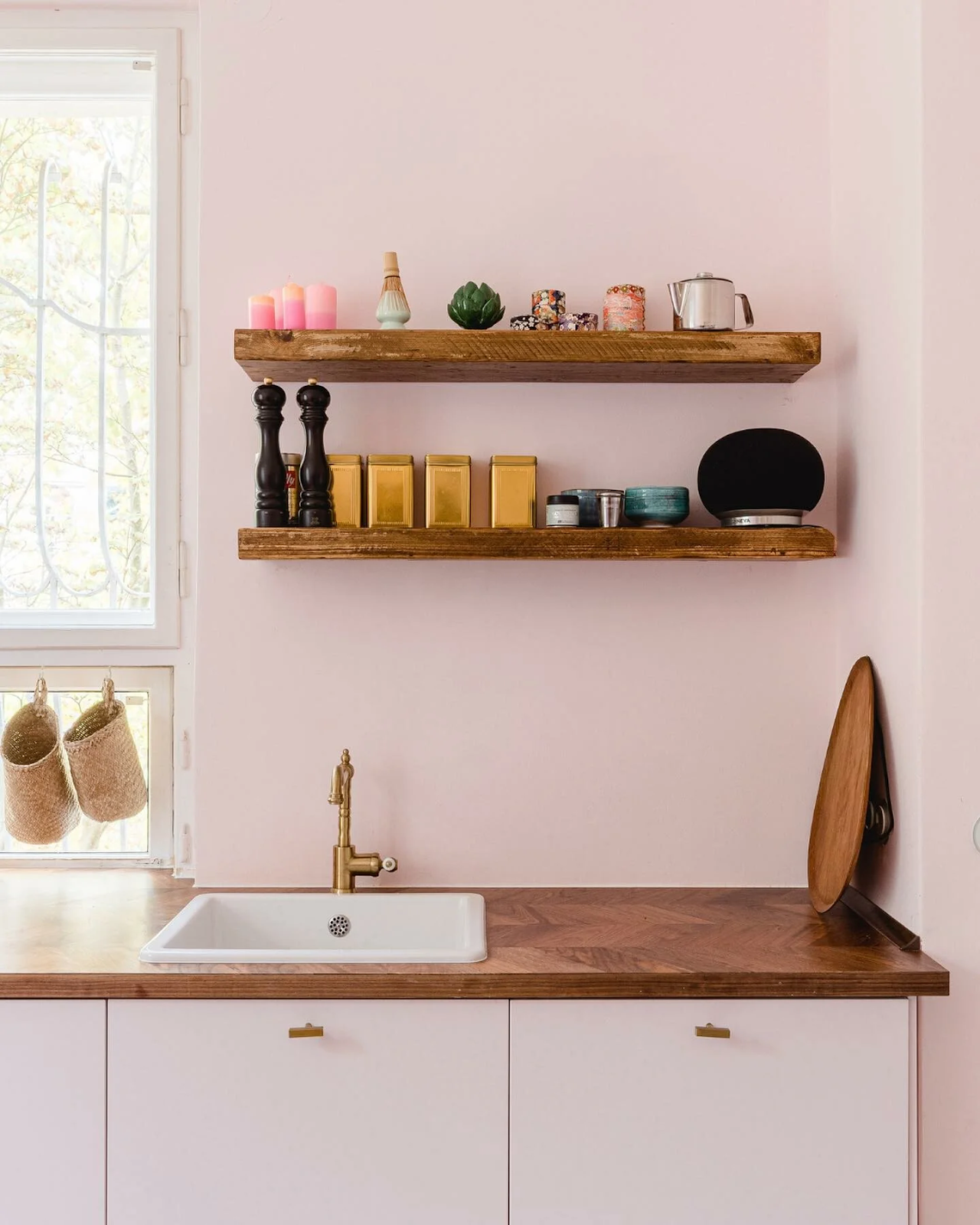
Middleton Pink has got to be one of Farrow and Balls prettiest pinks! When you think of pastel colours the first colour that pops to mind is often a pretty pale pink and Middleton Pink ticks all the boxes. It’s delicate but fresh and oh-so-easy on the eye.
It looks gorgeous when paired with rustic styling with touches of gold and greens. It looks glorious when used on bedroom walls creating a warm romantic feel but equally as charming on the kitchen and bathroom walls alike.
Get free colour card or order a sample of Middleton Pink Here.
Pastel Green: Eddy, Farrow and Ball
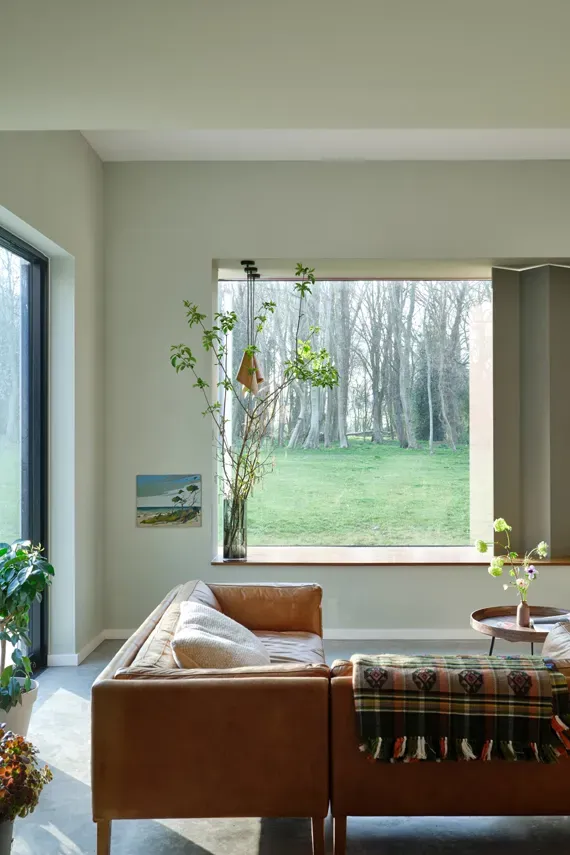
Here we have a gorgeous pastel green from Farrow and Ball. Eddy is a gentle green which will create a calming energy in whichever room you paint this beautiful pastel colour in. Its delicate earthy tones are a breath of fresh air, making Eddy a wonderful choice for a garden room paired with leafy green plants and warm furnishings. This calming pastel green is the perfect colour choice if you are wanting to create a relaxing working or chill out space and fresh and calming on your kitchen walls.
Order a sample here
Pastel Blue: Borrowed Light
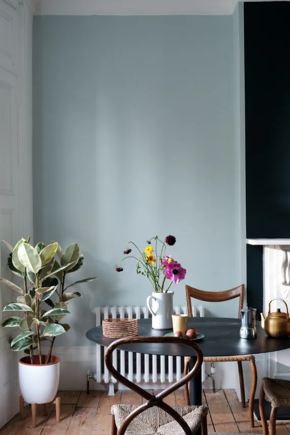
Next on our list is a wonderful pastel blue from Farrow and Ball, Borrowed Light. Inspired from the beautiful summer skies and the glorious light that shines through small windows and fanlights. I think you will agree Farrow & Ball have passed the assignment spectacularly when it came to creating this pale blue. The soft tones will brighten up a room which is deprived of light and look just as stunning in an airy room full of natural light. Borrowed Light would illuminate a children’s bedroom beautifully when contrasted with dark blue furnishings.
Pastel Yellow: Dayroom Yellow
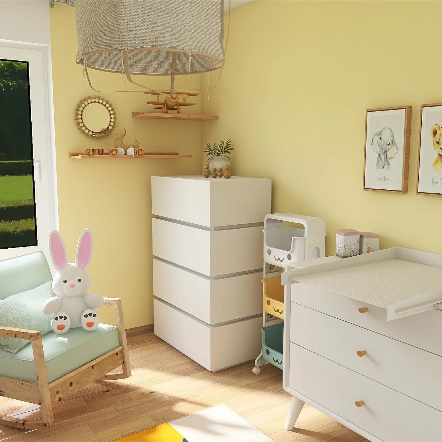
Warm and soft yellow is another classic that comes to mind when thinking of your favourite pastel colours, and Dayroom Yellow by Farrow and Ball fits this brief. A refreshing and charming pastel yellow that will bring a touch of joy to any setting and a smile to your face. A pastel yellow is the perfect choice for rooms with lots of natural light creating a joyous feel. Children’s bedrooms are a firm favourite for this colour choice. However, Daytime yellow will also brighten up your entryway walls and staircases with contrasting white woodwork.
Faded Terracotta by Farrow and Ball
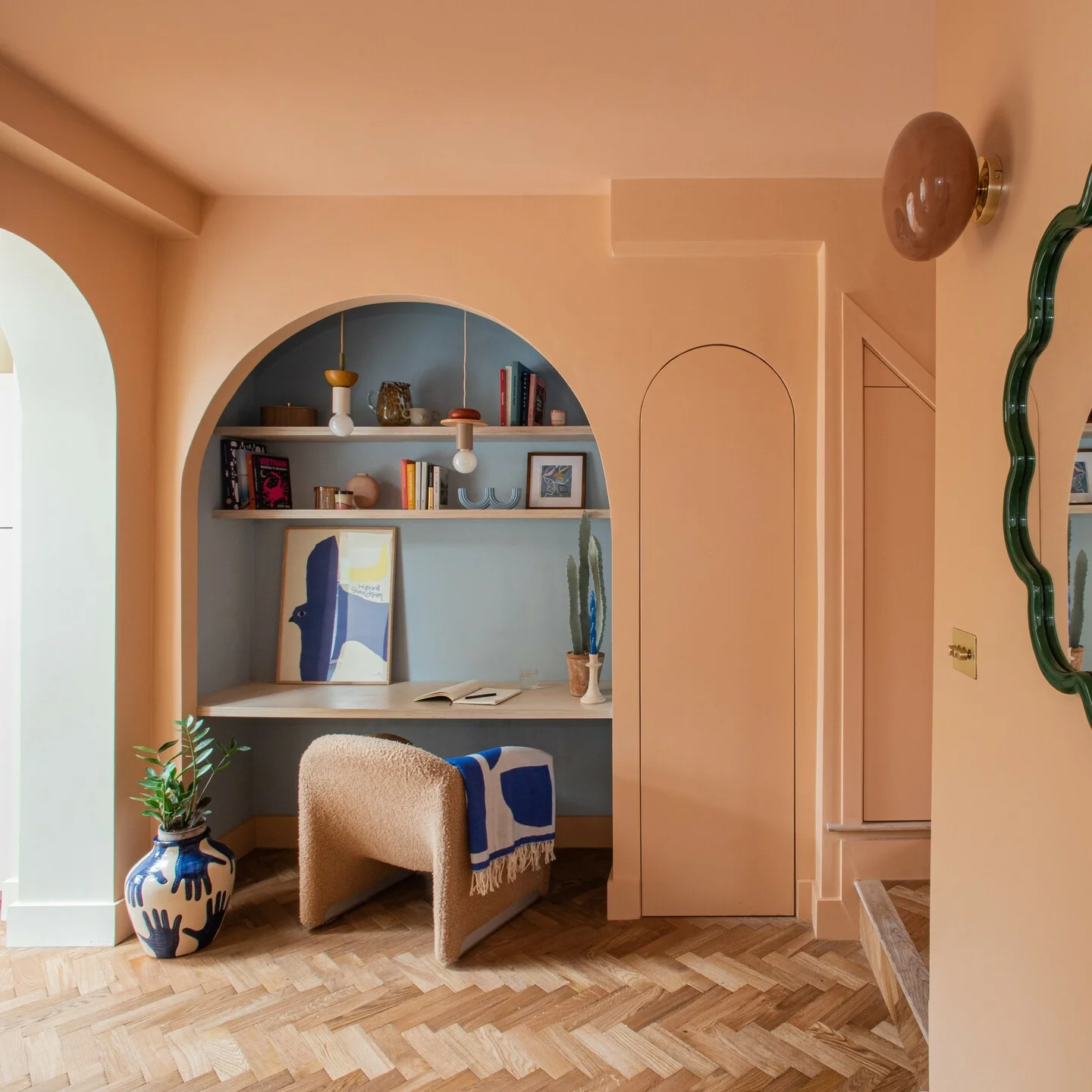
Faded Terracotta by Farrow and Ball is a soft pastel orange that is full of warmth inspired by the terracotta pots and tiles which are baked to a pale hue by the glorious California sun. This easygoing pastel shade will effortlessly bring character and softness to any setting. Terracotta colours look fabulous in entryways with touches of cool blue accessories which fantastically lift the colour. It’s diverse and looks glorious when used in the bedroom with rustic furnishings and especially dining room walls paired with warm peach and pink hues.
Pastel Purple Paint Colour: Sugared Almond
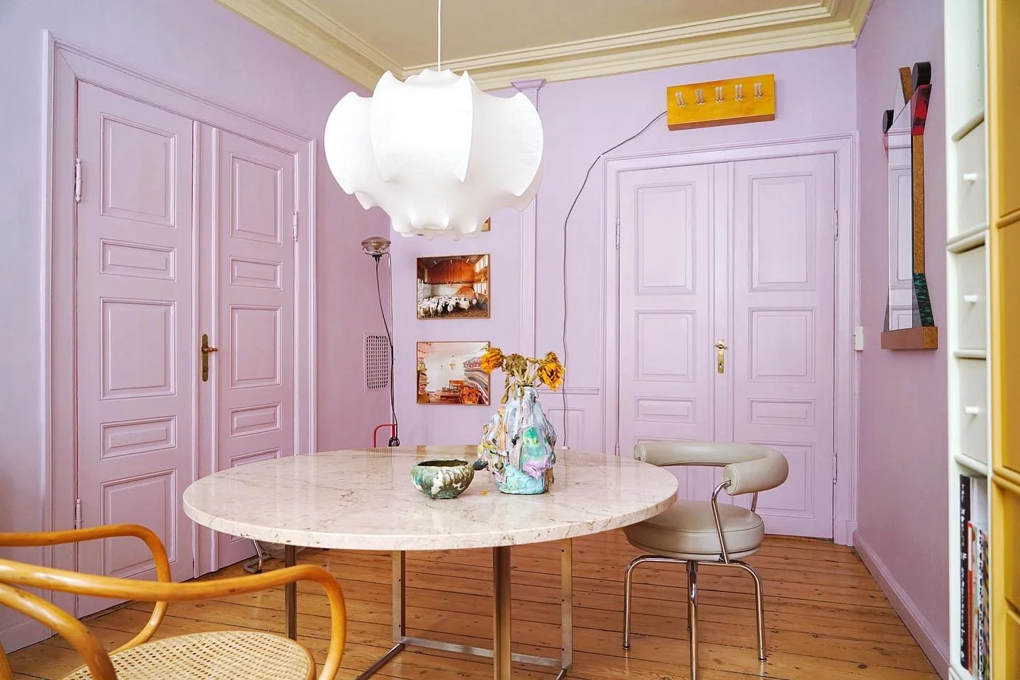
Sugared Almond has got to be the pastel colour of choice if you want to make a statement in your space in a charmingly playful way. This pastel lilac is full of character and will effortlessly showcases the playful side of your personality. This refreshing lilac packs a punch but is still soft enough to use on your bedroom walls, thanks to its cool blue undertones. Sugared Almond looks spectacular when paired with pastel yellow tones and crisp whites, working in perfect harmony with each other.
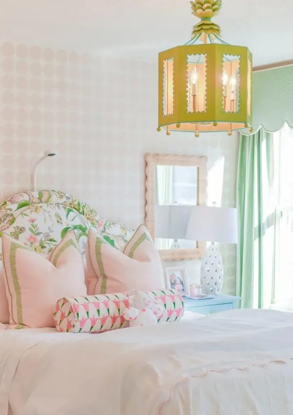
Sweet Embrace Dulux
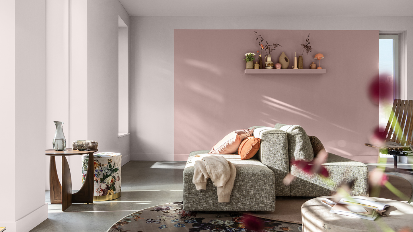
Next we have Sweet Embrace from Dulux. It is a gorgeous pastel pink which is certainly sweet with its gorgeous delicate tones, that feels like it will give your walls a “sweet embrace.” This pastel pink is perfect for the living room and bedroom settings. The light pink hues look divine paired with light greys and whites which bring out the cool tones in this pastel pink. Sweet Embrace was voted Dulux colour of the year 2024 and I can see why!
Blue Ground Farrow and Ball

Blue Ground from Farrow and Ball is a brilliant upbeat pastel blue which oozes personality. Almost turquoise in colour it’s both friendly and positive but never cold feeling despite its blue tones. Blue Ground is another popular choice for playrooms as a feature wall against white hues, creating an inviting atmosphere for little ones. Blue Ground also looks fantastic when used against darker shades such as deep greys on living room walls which really lifts this lovely pastel blue shade.
Pastel Green Paint: Hidey Hole by Little Greene
Little Greene has curated a perfectly pleasing pastel green of dreams with Hidey Hole. It’s rich in colour but the perfect pale pastel green hues ensure it doesn’t dominate the room creating a feeling of warmth and fun. This pastel green is versatile, looking stunning when used on kitchen walls adding charm and character. But also fabulous when used on sun room full of natural light, paired with pastel yellow accent pieces and other earthy tones.
Fruit Fool by Farrow and Ball
Farrow and Ball have treated us with another pastel which is fun and quirky with the pastel pink shade, Fruit Fool. Named after the post-war popular summer pudding! It’s full of sweet character but isn’t too loud due its underlying blue tone. Making this pastel pink shade the perfect paint to have as a feature wall with pastel blue and white accent pieces and accessories. Fruit Fool looks fabulous when used on bedroom or living room walls adding sweetness and charm.
Warm Sand by Dunelm
Dunelm has pulled it out the bag with this dreamy pastel – Warm Sand. This pastel shade instantly gives you a warm and cosy feel with its rich earthy tones. It will certainly give your living room or sunroom walls a glow up! Pair this shade with other natural accessories which will work in harmony with this pastel beige you can also add a touch of dark browns or blacks to make this pastel pop.
Pale Powder No.204 Farrow and Ball
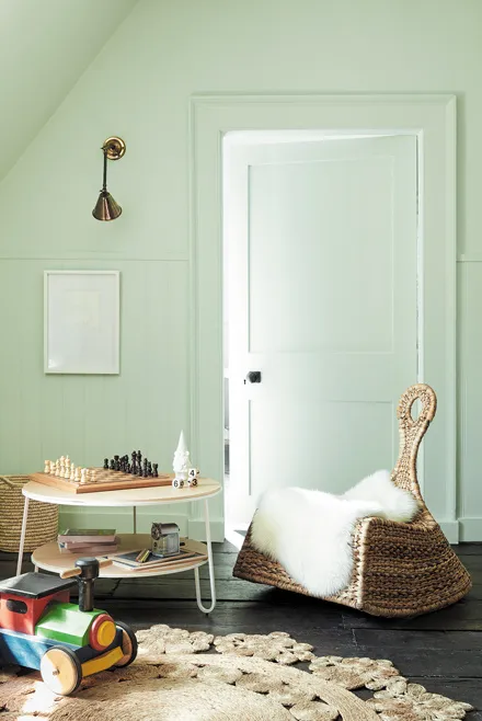
Pale Powder by Farrow and Ball despite its name this light pastel aqua is certainly powerful and will still make a statement in your interior stylings. This aqua is unbelievably soft and in north-facing rooms may almost be mistaken as a soft grey, but the gorgeous green pigments stop this pastel aqua from feeling cold. Pale Powder looks fabulous in attic bedrooms when coated on both the ceilings and walls creating a feeling of more space and a light and breezy atmosphere.
Farrow and Ball Arsenic

Pastel’s don’t always need to be on the neutral side; you can opt for a vivid mint green colour which is still light and airy but will still bring a fashionable pop of colour to your interior designs. This pastel mint green would look cool and contemporary on the walls of a vintage dining room paired with sleek white and black accent pieces to bring the wow factor. Arsenic would look equally as stylish on your bathroom walls with traditional white tiles and leafy green plants.
Pastel Yellow: Tallow
Last but not least we have a lovely pastel cream shade, Tallow. It’s a gorgeous pastel which will beautifully illuminate any room with its gorgeous hints of pink and yellow pigmenting which creates a warm but crisp feel. Tallow would look stunning in a bright and airy kitchen as the pale cream finish reflects the light brilliantly, also making this a great choice if you want to brighten up a room which lacks natural light. Pair this pastel cream with crisp white accessories and other warm shades to bring out the beautiful undertones in this colour.
Leave a Reply