
Wimborne White is a slightly off-white with just a touch of yellow pigment that makes it the perfect choice for creating a space that feels both warm and bright.
It’s one of those colours that can work well in literally any room of the home, from the bathroom to the living room, and even in the bedroom. The soft warmth it exudes gives it an elegance that works particularly well in period properties.
Today, I’m sharing some of my favourite ways to use Wimborne White in your home. I’ll also share some of the best colours to pair it with, which will enable to to create the perfect scheme for your own home.
Get a Sample of Wimborne White Here, or a Free Farrow and Ball Colour Card
Wimborne White Living Room
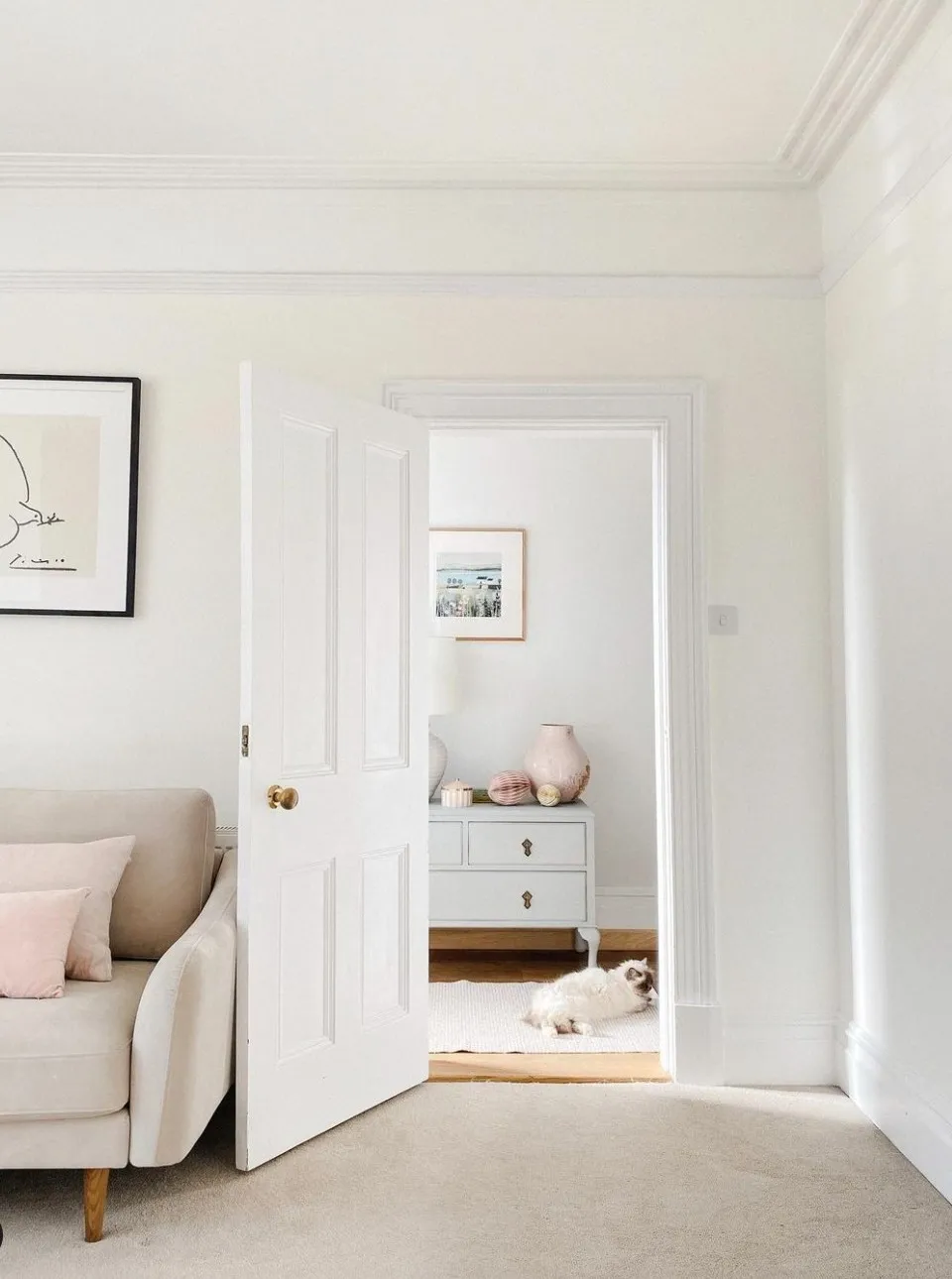
Image Credit: @home_with_rose
Rosemary Bickers from @home_with_rose used Wimborne White on the walls in her living room. The skirting boards and woodwork have been painted in a brighter white. This helps to emphasise the gorgeous warmth of Wimborne White. Paired with a beige carpet and sofa, and dusty pink accents, the result is a space that feels wonderfully calming and peaceful.
Elegant Entrance Hall and Staircase
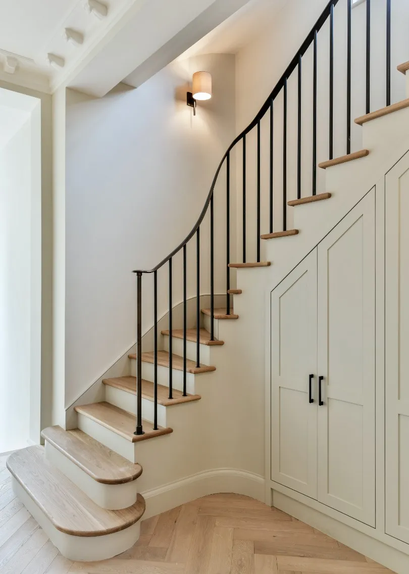
Design by Fox Interior Design | Photography Ben Thompson Photography
This stunning entrance hall has been painted entirely in Wimborne White, with a beautifully curved bronze balustrade for contrast. As you can see, this subtle paint colour works really well with the light oak floors. The result is an effortlessly elegant, timeless space.
Get a Sample of Wimborne White Here, or a Free Farrow and Ball Colour Card
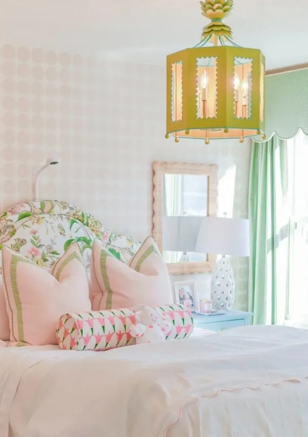
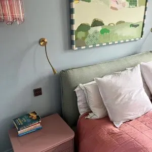
Farrow and Ball Wimborne White Bedroom
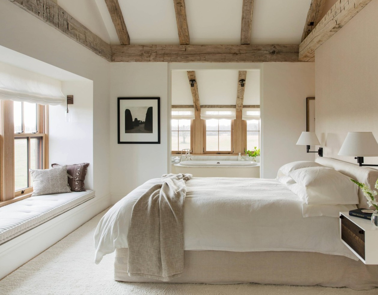
Image via Pinterest, Author Unknown
This serene and calming bedroom exemplifies the beauty of Farrow & Ball’s Wimborne White. The paint has been used on the walls to create a soft and inviting atmosphere. The paint’s delicate warmth is highlighted by the room’s natural light, streaming in through large windows framed in natural wood. The exposed wooden beams on the ceiling echo the natural wood tones of the window frames. This has added a rustic touch to this otherwise modern and minimalist space.
The design showcases a harmonious balance of textures—soft fabrics, cosy pillows, and the light beige headboard combine effortlessly with the neutral wall colour to evoke a sense of tranquillity. Wimborne White serves as a perfect backdrop, amplifying the room’s brightness while subtly complementing the various organic elements.
A built-in window seat invites relaxation, with plush cushions that add an extra layer of comfort to the space. The soothing, muted tones of the bedding and decor, along with the neutral palette, enhance the room’s peaceful ambiance. This bedroom is a great example of how Wimborne White can transform a space into a calming retreat. Simplicity and comfort reign supreme.
Rustic Kitchen in Wimborne White
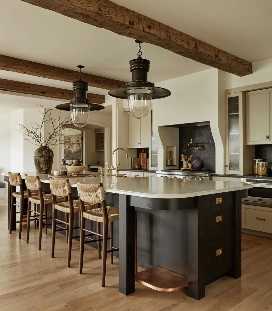
Image credit: @beccainteriors
I’m in love with this gorgeous rustic kitchen painted in Wimborne white with dark accents on the base of the kitchen island, splashbacks, and pendant lights. Unlike harsher whites, Wimborne White’s creamy warmth perfectly complements the natural elements in this kitchen without feeling stark or cold.
The exposed wooden beams on the ceiling and the wooden bar stools with woven seats create a rustic contrast with the modern, sleek cabinetry and marble countertops. These natural, earthy tones pair harmoniously with Wimborne White. The walls act as a neutral backdrop, allowing these rich textures and materials to stand out.
The kitchen island’s darker finish anchors the room. It brings in a sense of depth and contrast against the lighter walls and floors. The lighting fixtures, with their industrial vintage charm, further enhance the overall design. This creates a wonderful balance between old and new styles.
Get a Sample of Wimborne White Here, or a Free Farrow and Ball Colour Card
Wimborne White and French Gray
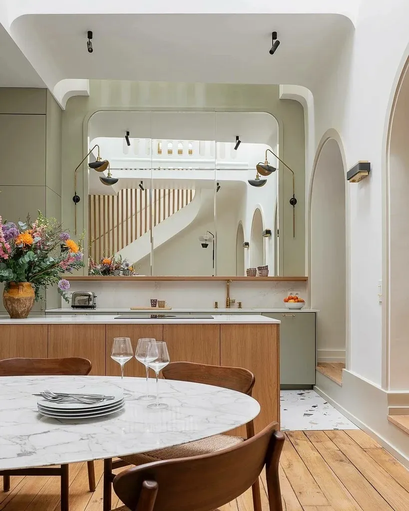
Image credit: Farrow and Ball
This striking and modern kitchen-dining area features a sophisticated colour palette of Farrow & Ball’s Wimborne White and French Grey. The soft, creamy tones of Wimborne White grace the arched walls and ceiling, providing a clean and airy backdrop that enhances the natural light and the architectural details of the room. The use of arches and curves in the design lends a sense of elegance, while the bright, neutral colour makes the space feel open and expansive.
French Grey adds depth and contrast, particularly on the cabinetry and the subtle panelling. This muted, earthy tone perfectly balances the lightness of Wimborne White. The blend of these two colours creates a seamless harmony between the crisp modern elements and the more traditional materials, such as the warm wood floors and furniture.
This design is a wonderful example of how Wimborne White and French Grey can work together to create a modern, timeless space that feels both fresh and cosy. The soft contrast between the colours accentuates the architectural features while maintaining a warm and welcoming ambiance, ideal for those looking to blend classic style with contemporary design.
A Warm and Bright Dining Room
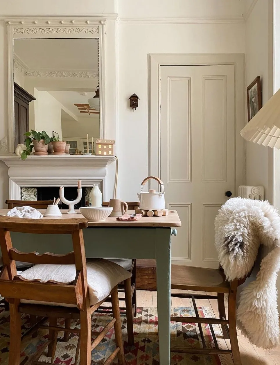
Design by @home__stead
Walls: Wimborne White
Woodwork and Trim: Shadow White
This cosy and charming dining room features Wimborne White on the walls, creating a warm and serene backdrop that perfectly complements the rustic, cottage-inspired decor.
The soft, off-white tone of Wimborne White brings an understated elegance to the room. This subtle colour enhances the room’s natural light, making the space feel open and airy while maintaining a comfortable, lived-in feel.
The earthy warmth of the wooden dining table and chairs contrasts beautifully with the neutrality of the walls. This dining room is an excellent example of how Farrow and Ball Wimborne White can be used to create a soft, harmonious space that feels both timeless and inviting, ideal for casual, intimate meals in a relaxed and charming setting.
What Colour Goes With Wimborne White?
One of the best things about Farrow and Ball’s Wimborne White is that it pairs well with pretty much any colour.
If you’re looking for another white to pair with Wimborne White, All White is a great option. Since All White is a completely pure white with absolutely no other pigments, it’s a great option for using on woodwork and trim if you’ve got Wimborne White on the walls. Shadow White is another great choice.
Get a Sample of Wimborne White Here, or a Free Farrow and Ball Colour Card
Leave a Reply