
Choosing the right paint colour can transform the atmosphere of a space, and Tranquil Dawn by Dulux is a shade that does just that. This beautifully soft, muted green with subtle gray undertones is designed to evoke the calm of a fresh morning sky. This makes it the perfect choice for creating a serene and welcoming home. Whether you’re looking to refresh your living room, bedroom, or even a kitchen, Tranquil Dawn brings a sense of balance and sophistication while remaining incredibly versatile. In this post, I’ll be sharing some of my favorite examples of how to incorporate this soothing shade into different interiors, the best colour pairings, and why it’s become a go-to choice for modern, tranquil spaces.
Dulux Tranquil Dawn Nursery
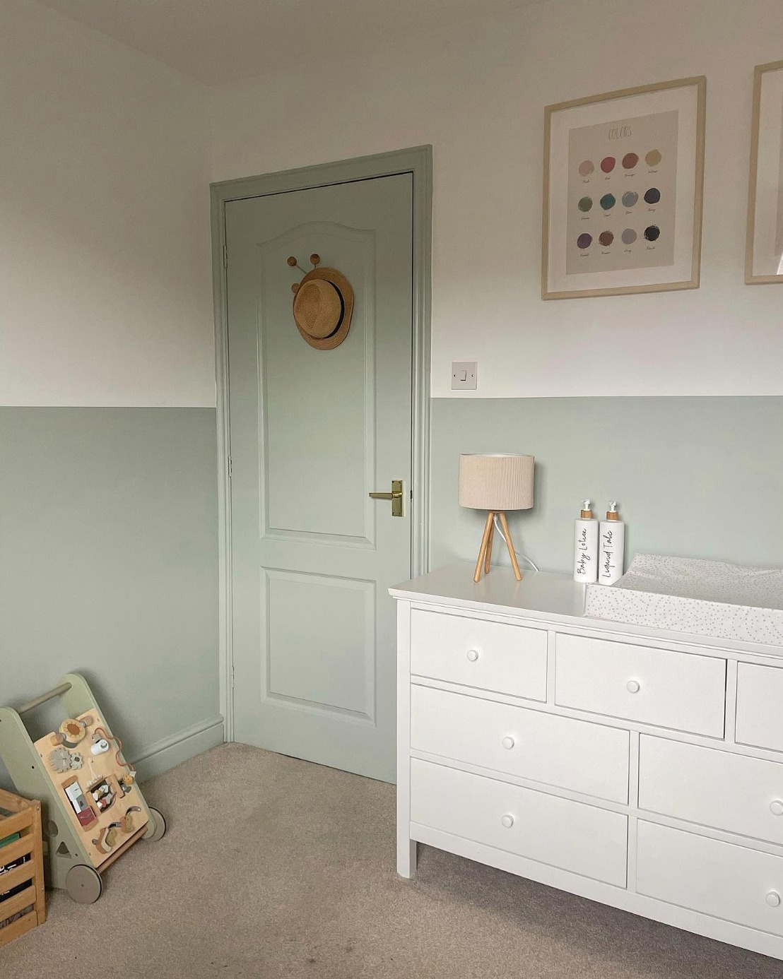
Image Credit: Fliss – @littlehouseonourstreet
This beautifully designed nursery showcases the soft and soothing appeal of Tranquil Dawn by Dulux. The gentle green hue, used on the lower half of the walls and door, creates a calming and serene atmosphere, perfect for a peaceful space. Paired with crisp white furniture and warm wooden accents, the colour enhances the room’s airy and minimalist aesthetic. Thoughtful decor elements, such as framed artwork and neutral textiles, add a cosy yet modern touch.
Modern Tranquil Dawn Kitchen
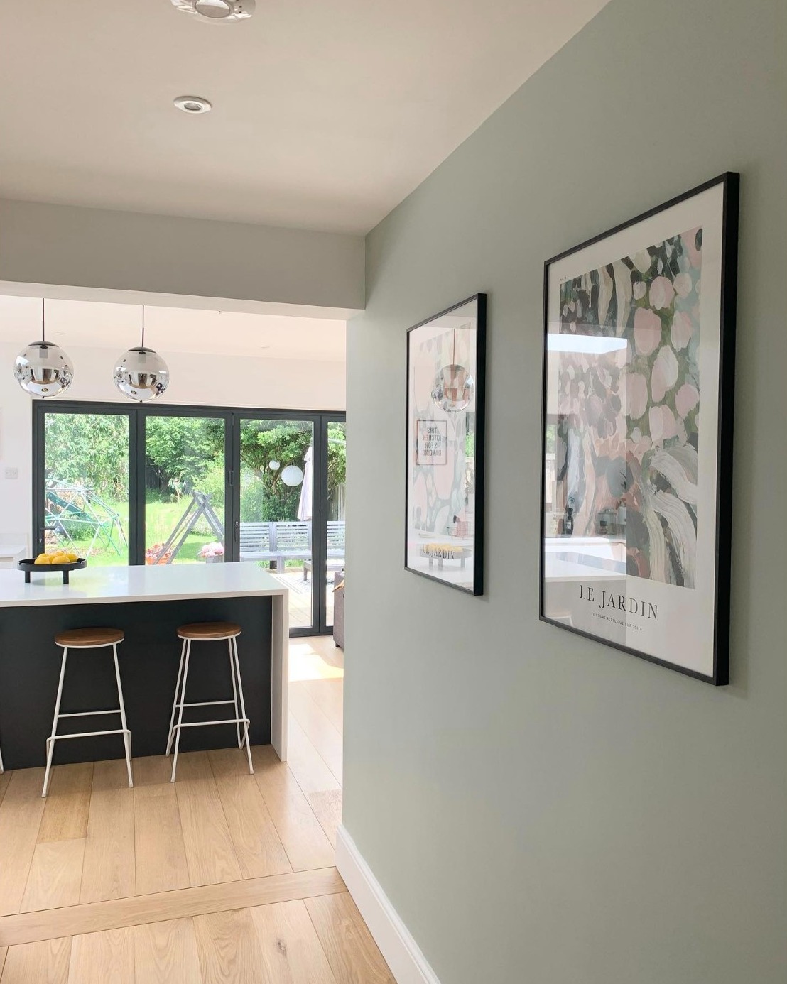
Image Credit: Bon & Pete @rockthehaus
This modern open-plan space beautifully incorporates Tranquil Dawn, bringing a soft and refreshing touch to the hallway. The muted green walls create a seamless transition between the kitchen and living area. This complements the light wood flooring and sleek, contemporary furnishings. Framed artwork and black accents add a stylish contrast, while natural light from the large glass doors enhances the airy and inviting feel. The subtle green tone of Tranquil Dawn works effortlessly with the neutral palette. This just goes to show its versatility in both classic and contemporary interiors. Overall, this space exudes a sense of calm, balance, and understated elegance.
A Beautiful Tranquil Dawn Colour Scheme for a Bedroom
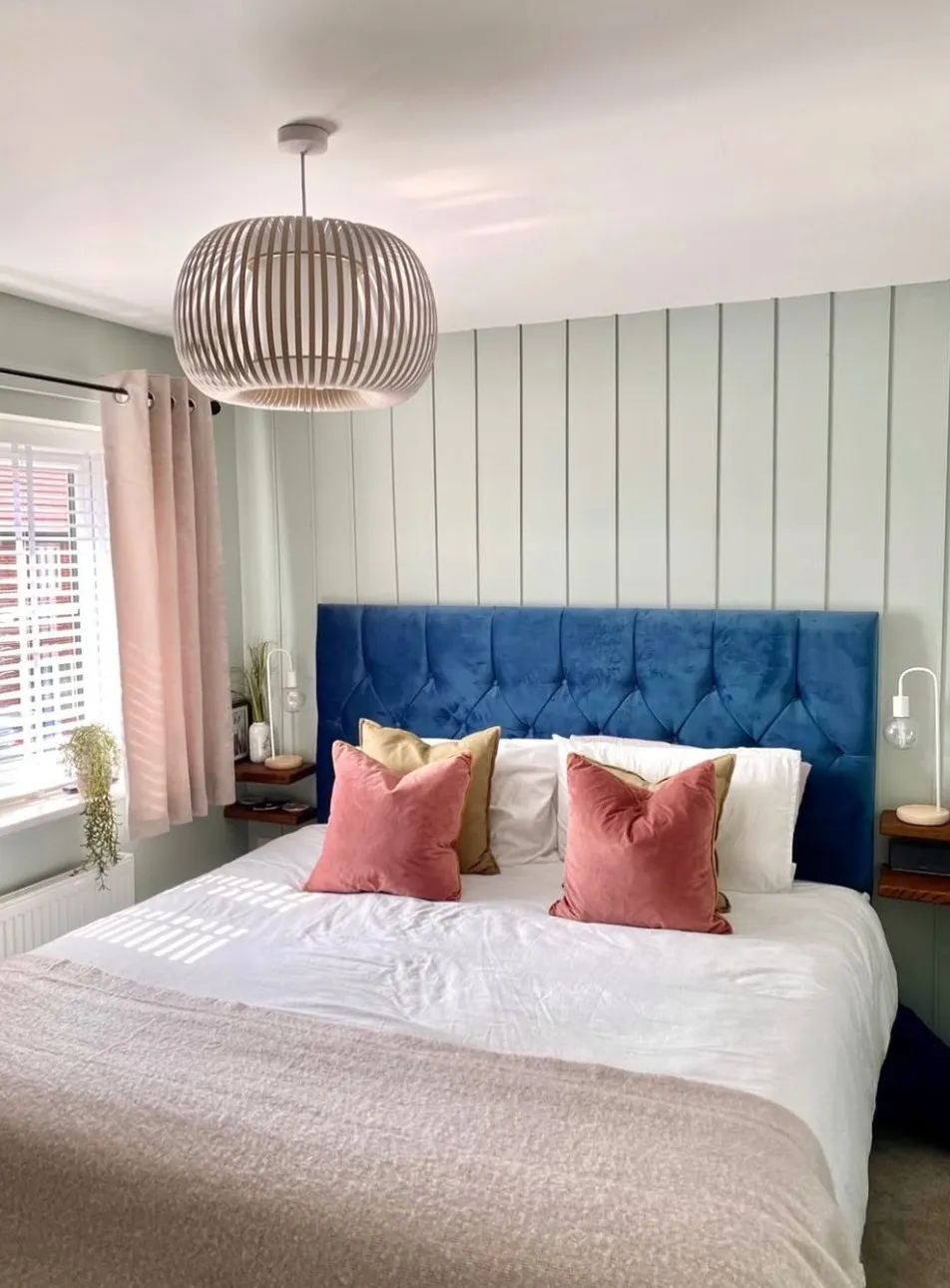
Image Credit: Charlie & Theo @walksontour
This stylish bedroom showcases Tranquil Dawn by Dulux, creating a soft and serene atmosphere. The muted green hue enhances the vertical paneling, adding depth and texture to the space while maintaining a calm and airy feel. The plush navy blue headboard introduces a bold contrast, making the bed a striking focal point. Blush pink and warm beige accents in the cushions and curtains add warmth and elegance. Thes helps balance the cool tones of the walls.
Tranquil Dawn Master Bedroom Design
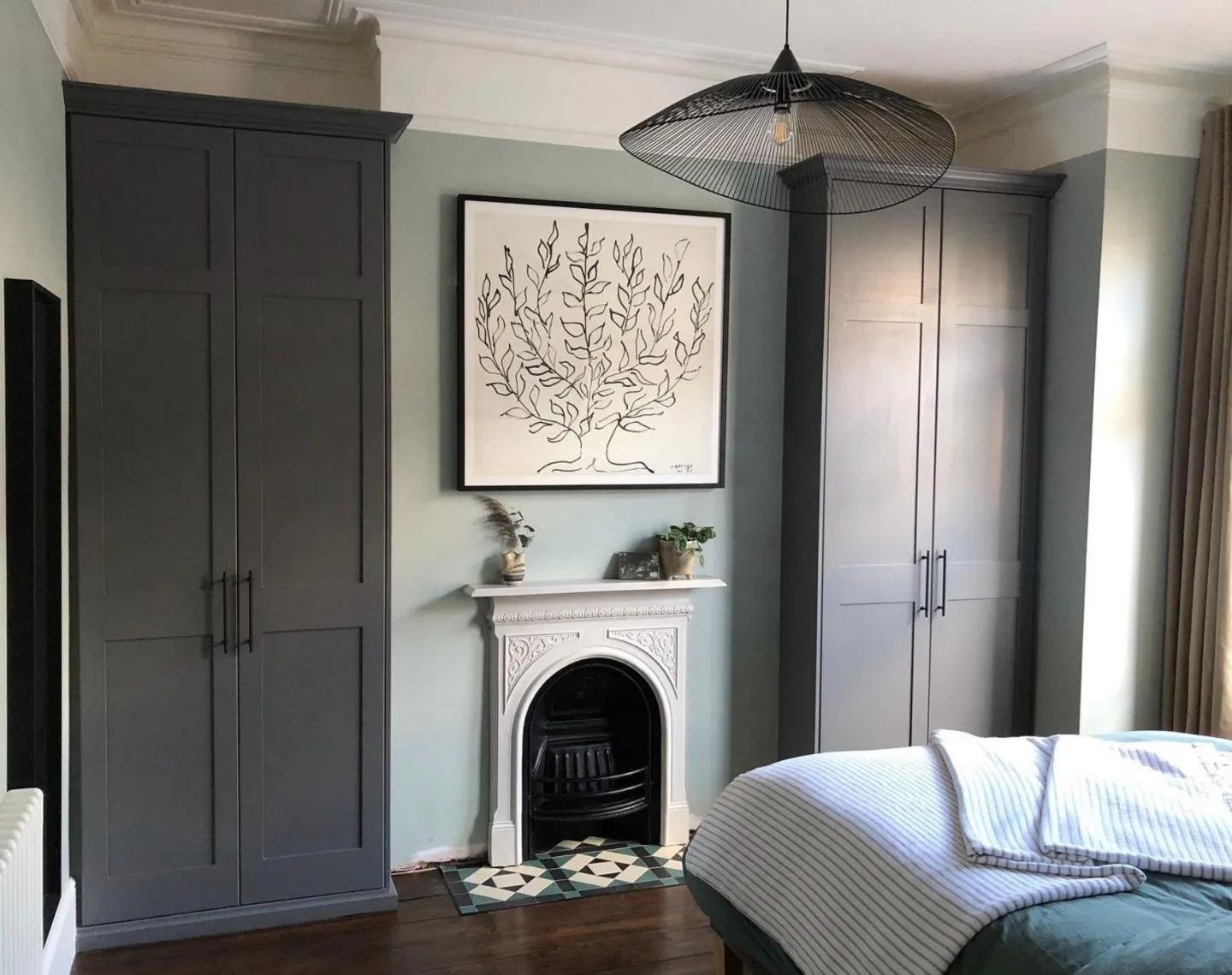
Image Credit: Eoin & Christing @our_tooting_terrace
Tranquil Dawn is renowned for being one of the most calming bedroom colours. The muted green walls bring a soothing presence to this master bedroom. This is balanced by the deep charcoal wardrobes that add depth and contrast. The classic white fireplace provides a timeless focal point, while the black wire pendant light and minimalist artwork introduce a modern edge. Earthy beige curtains and a cosy textured duvet enhance the warmth of the room, blending effortlessly with the natural wood flooring. This space is a stunning example of how Tranquil Dawn can be paired with bold, dark tones to create a balanced and stylish design.
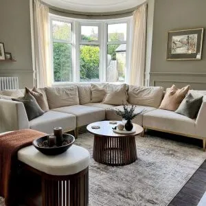
Tranquil Dawn Living Room
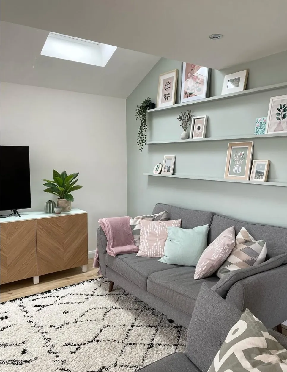
Image Credit: Rebecca @our_family_at_tulip_house
This effortlessly refined living space showcases Tranquil Dawn by Dulux in a way that feels both contemporary and timeless. The soft green hue, delicately framing the floating shelves, introduces a whisper of colour that enhances the room’s serene aesthetic without overwhelming the senses. A structured gray sofa, adorned with pastel-hued cushions in blush and mint, adds an understated elegance.
Tranquil Dawn Bedroom with Grey Accents
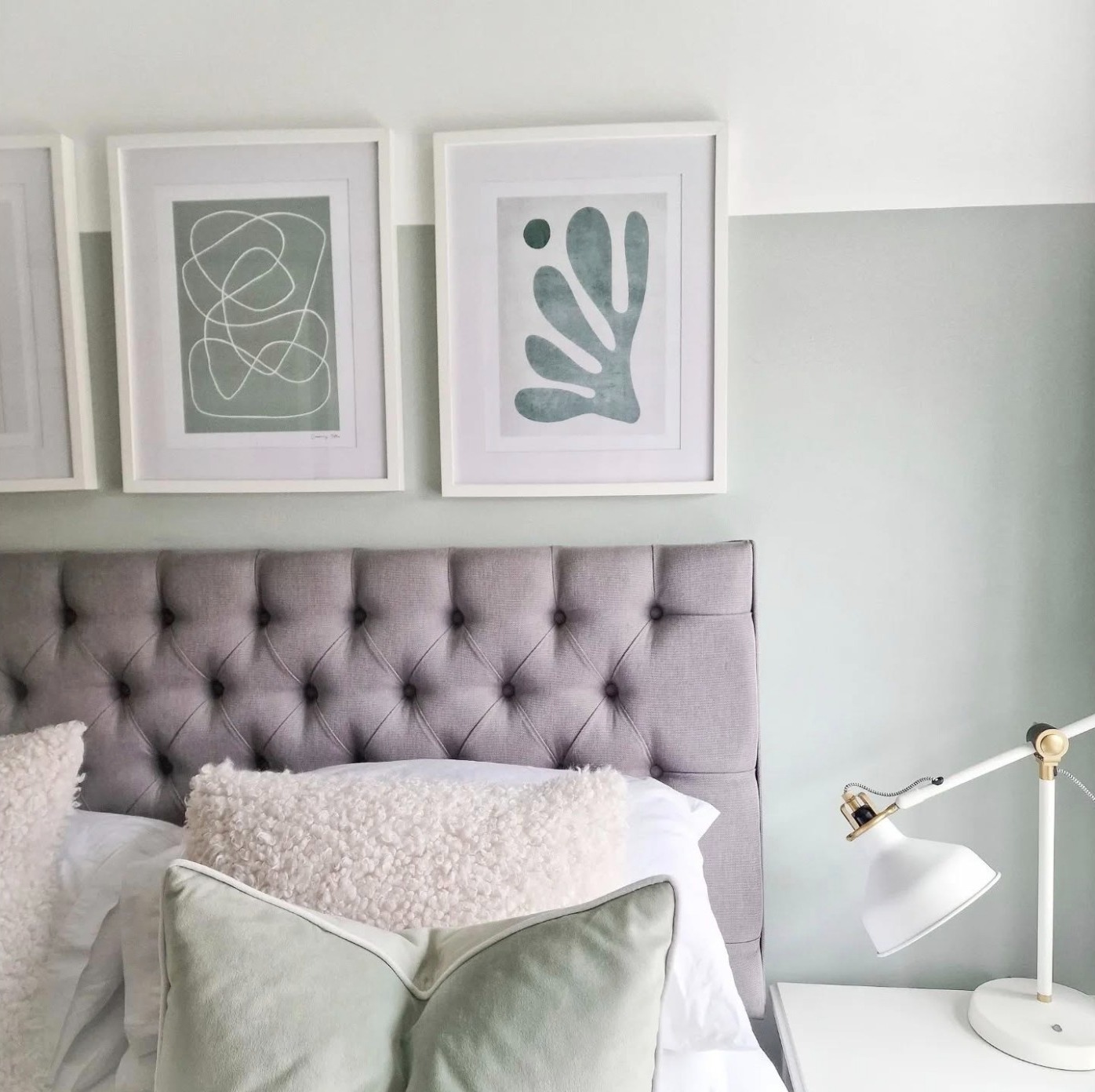
Image Credit: Kate Browczuk @katebrowczuk
This two-tone wall treatment, with its soft Tranquil Dawn base and crisp white upper, creates a sense of height and lightness. This makes the space feel both airy and cocooning. The tufted gray headboard lends a touch of classic sophistication, its plush texture mirrored in the layering of tactile cushions—from bouclé to velvet. Abstract artwork in tonal greens reinforces the room’s serene aesthetic, while brass detailing on the sculptural bedside lamp adds a whisper of refinement. Thoughtfully composed, this space is a study in balance—where muted hues, sumptuous textures, and subtle contrasts come together to craft an environment of effortless tranquility.
Tranquil Dawn Fading to Denim Drift
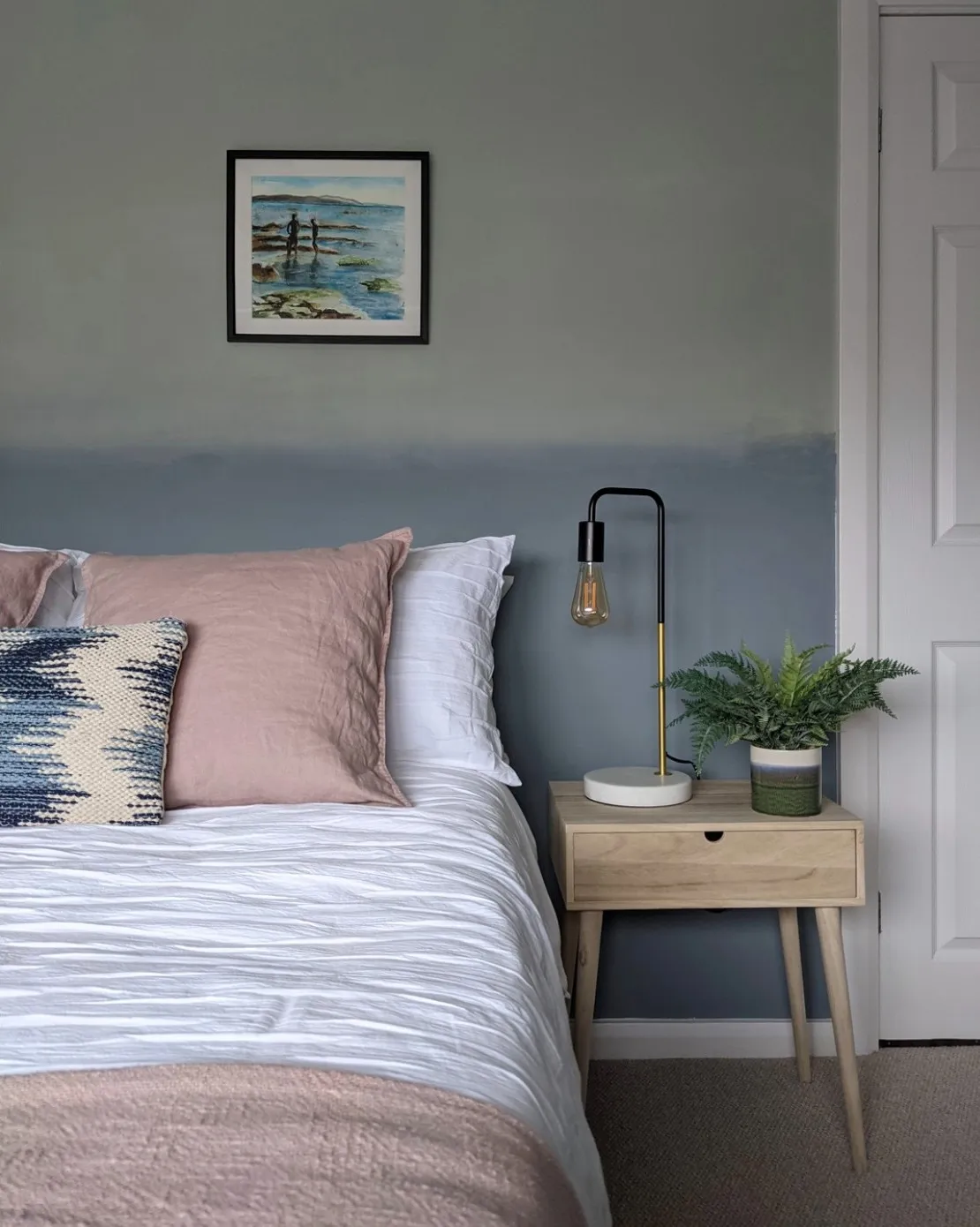
Image Credit: @nospacelikehome.uk
This stunning painterly ombré wall treatment, seamlessly blends Tranquil Dawn by Dulux with the deeper, moody tones of Denim Drift. The transition between soft sage and stormy blue creates a dreamy, atmospheric effect, evoking the shifting hues of the sky at dusk. A delicate balance of textures enhances the aesthetic—crisp white bedding provides a fresh contrast, while blush linen accents introduce warmth and softness. If you’re looking for a two colour combination for bedroom walls, this is a great option.
New Build with a Dulux Tranquil Dawn Dining Room
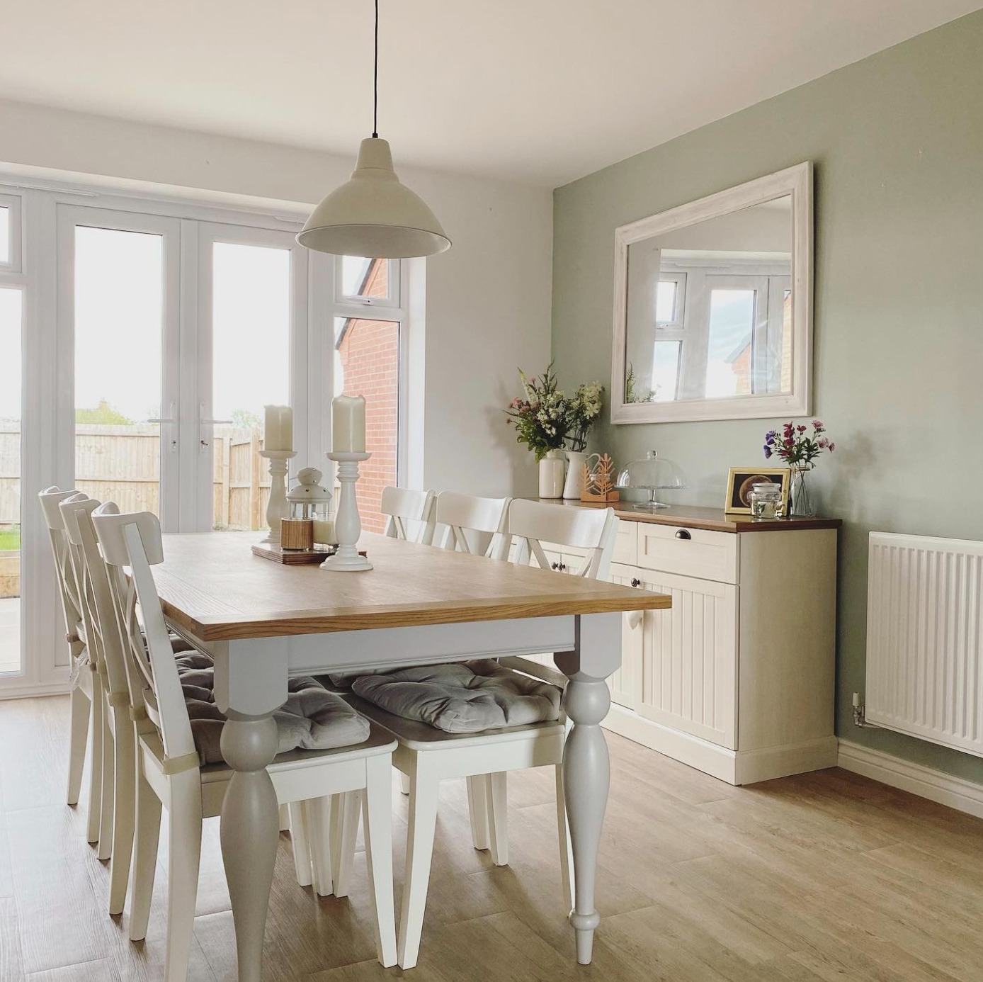
Image Credit: @ourthornfordhome
This elegant dining space is a masterclass in relaxed, country-inspired refinement. Tranquil Dawn by Dulux provides a soft, muted backdrop that enhances the light and airy ambiance. This delicate green hue harmonises beautifully with crisp white furnishings. And I love how the natural wood tabletop and flooring introduce warmth and texture to what otherwise would be quite a cool space. Subtle decorative touches, such as candlelit centerpieces, fresh florals, and a distressed wooden mirror, create a sense of effortless charm.
Dulux Tranquil Dawn Kitchen Design
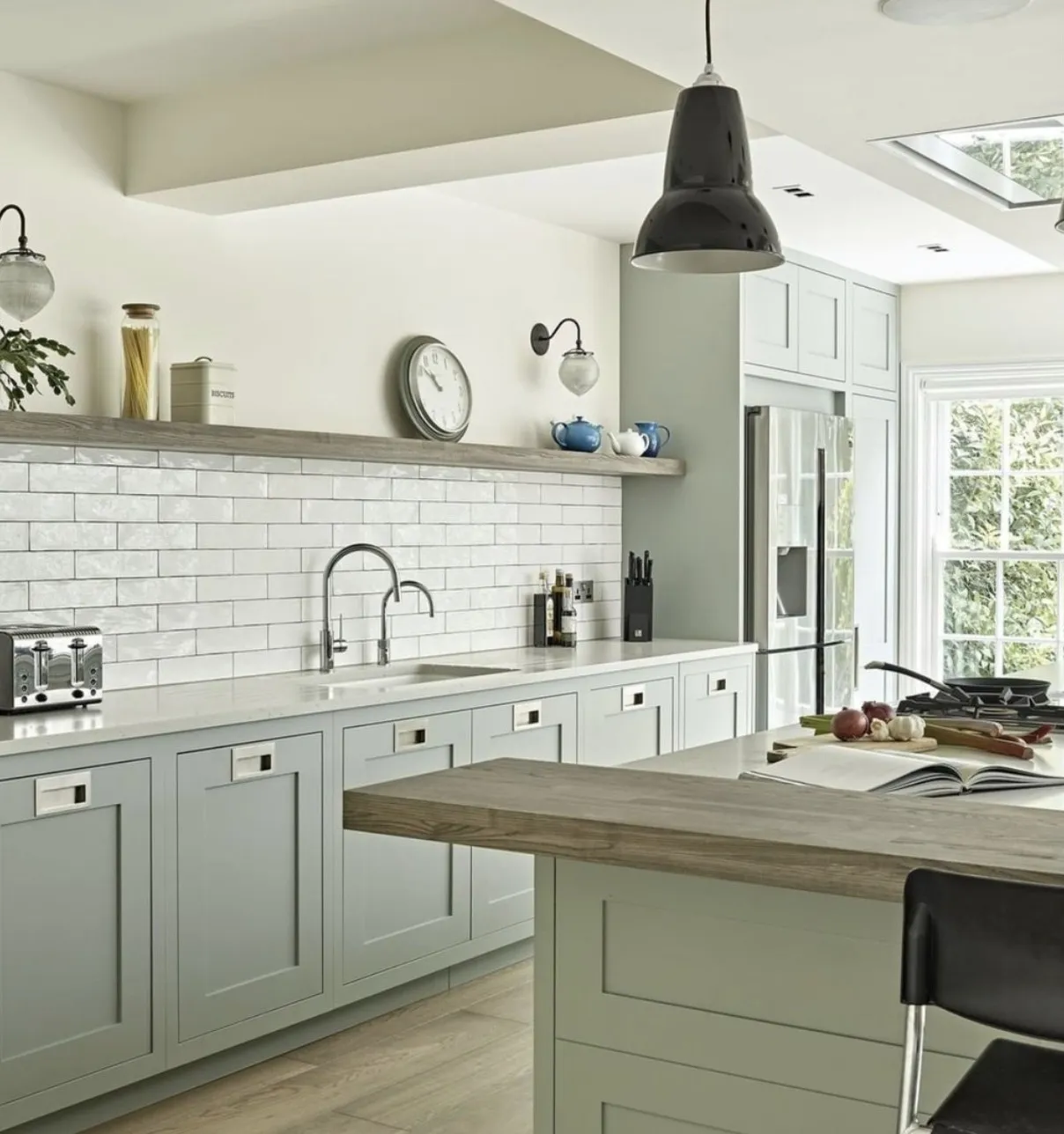
Image Credit: @loverenovate via @brayerdesign
Tranquil Dawn envelopes the cabinetry in a soft, muted green that feels both contemporary and timeless. The colour’s delicate, nature-inspired quality is beautifully offset by crisp white subway tiles. This creates a striking contrast while maintaining an airy, open feel.
What Colour Goes with Tranquil Dawn?
Dulux Tranquil Dawn goes really well with pure white, grey, black, and natural tones such as light wood.
If you’re looking for the best white to pair with Tranquil Dawn, you can’t go wrong with Dulux’s Pure brilliant White.
And if you’re looking for a brighter accent colour to pair with Tranquil dawn? Try a rosy pink, like Pink Skies, or Sorbet.
Leave a Reply