When Emily agreed to allow me free reign at drafting a guest post for her blog, I decided that she’d clearly had a nervous breakdown. Or maybe she’d simply lost the plot because of all the excitement due to being a fellow shortlister for the Amara Interior Blog Awards. Either way, I was thrilled to have the opportunity to collaborate with her.
It all started when Emily and I realised that we were both creating similar blog posts for Autumn inspired styling.
This is Emily’s work of genius…
And this is mine.
Being a 3D Visualiser, when I’m particularly excited by a certain design theme/style I sometimes create a photo-real 3D visual of an entire design scheme to try and illustrate that specific look or aesthetic.
I had a simple goal with the Autumn inspired 3D visual: it had to evoke the essence of Autumn but in a contemporary, urban style and without the stereotypical berries, conkers and dried-up leaves.
Although, let’s be honest, dried-up leaves are pretty awesome.
I also wanted that ‘glossy interiors magazine front cover’ quality. You know where they zoom in on a certain portion of a room and it’s all ‘don’t mess with me, I’m fabulous and you know it’.
Easier said than done, let me tell you.
So, once I created the ‘bones’ of the design scheme I asked our friend, Emily if she would mind selecting a few knick-knacks (technical term for accessories in the design industry) that would compliment my design.
She didn’t let me down.
Let’s take a look at the final design, shall we?!
BOOM!

Ok, this is where I do a few squats, roll up my sleeves and face the daunting task of trying to explain this blinkin’ design.
Let’s break this down.
The colour palette provides the drama in this interior; the inky dark hue (Hague Blue, Farrow & Ball) is moody, atmospheric and is the perfect backdrop for both orange and metallic accents.
I mean seriously, how gorgeous are those vintage bulbs? Their brass detailing is majestic when set against such a dark and mysterious hue.
But using just metallics and orange is a bit limiting, right? You gotta include a third colour to help add more visual interest. So I included a very soft blue. This particular shade of blue can be seen in the Jessica Zoob cushion (available at Romo) the rickety and quite frankly, AWESOME chair and in elements of the artwork.
Genius, if I don’t mind saying so myself.
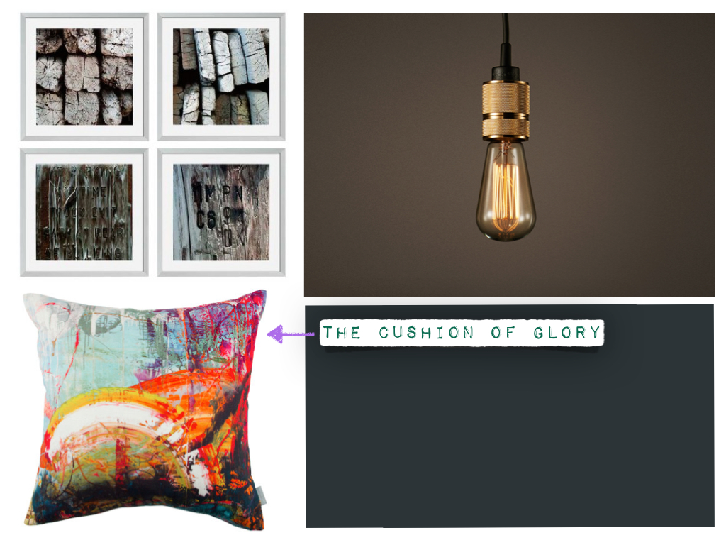
I’ll tell you something else that’s genius: that flippin’ cushion. It’s actually one of Jessica Zoob’s pieces of original art PRINTED onto a cushion. I WANT and NEED to shake the hand of the person who came up with that bright idea. Actually, never mind shaking his/her hand, I’d give that person a full-on bear hug.
A bear-hug that would overstep the boundaries of social etiquette, by lasting at least 15.2 seconds.
What I’m trying to say is: I LOVE THAT CUSHION and I think we belong together.
This design scheme is quite urban in style. When I say ‘urban’, I mean it has injections of industrial inspired design. From the art (Occa-Home), to the slightly distressed chair, to the raw bulbs hanging so gloriously low at each side of the sofa. And let’s not forget the upcycled, rusty metal coffee table.
And it also flies in the face of tradition, in other ways. You’ve noticed the lack of side tables, right? The chair IS the side table in this room. You might have noticed the asymmetry, with the chair being placed on one side of the sofa but nothing to counterbalance it on the other side?
Contemporary, urban inspired spaces are much more kooky and intriguing when they don’t conform. Actually, the 3 prints on the wall aren’t even centrally positioned. Again, this was intentional.
I’m not going to lie, I did surrender to my OCD and centred those prints and then moved them back to their off-centre location.
I did this about 3 times.
I know.
Let’s talk about Emily’s contributions to this design. She actually provided me with loads of great items to choose from but due to time constraints (of creating the 3D model), I could only select a certain number of them. And may I add, that she had made her selections and emailed them to me in a quirky little presentation, in the same timeframe that it takes to make a brew.
Astonishing.
Emily suggested the orange candlestick (which has been placed in the background and off-centre so as not to distract the eye), the amazing copper tray, the glass paper weight, those downright kooky tea-light holders with metallic orange inserts, and the Design Sponge coffee table book.

She did a fantastic job of adding visually pleasing and eye-catching accessories that help pull the whole design together.
Sometimes, when us ‘creatives’ put a design together, wonderful mistakes can happen. And in this instance, the teal coloured cushion was my ‘mistake’. It was supposed to be grey and I had every intention of changing it to the colour grey via the awesomeness of Photoshop but I felt that it looked so great with the dark backdrop and subdued purple/grey throw, that I kept it.
That can be our wee secret.
Which reminds me, I forgot to mention the throw. I decided early on, that this sofa would be adorned with a throw. This interior is supposed to be evocative of Autumn. We have the rustic flowers, the obligatory twigs, orange accents and metallics: and all combined they provide a wonderful Autumn ‘bubble’. But when the days get shorter and the evenings darker, there’s nothing more comforting than a lush throw. Buy similar at Rocket St. George.
Plus, it adds that all important element of texture.
I hope that my mutterings on the rationale behind this Autumn inspired interior have been useful and I thank Emily for allowing me to ruin her reputation and credibility as an Interior Design blogger!

This is brilliant work, you two work well together. I hopoe to see more collaborations in the future, because the results are FAB!
Well thanks!! Glad you like the results 🙂
P.s Sorry for the late reply, I don't know how I missed this comment!
Thanks for reading xxx