
Cornforth White is one of Farrow and Ball’s best-loved neutrals. The colour is from their ‘Easy Neutrals’ range and is named after John Cornforth, the esteemed architectural historian and author. It’s one of the most versatile colours in their collection, and it’s easy to see why it’s so popular. This soft grey is perfectly balanced between warm and cool, and because of this, it’s ideal for creating calming yet sophisticated colour schemes.
In this article, I’m sharing some of my favourite examples of how this colour can be used in the home. So whether you’re looking for the perfect colour for your master bedroom, kitchen, or living room, hopefully you will find some inspiration here.
Cornforth White and Navy Blue Kitchen
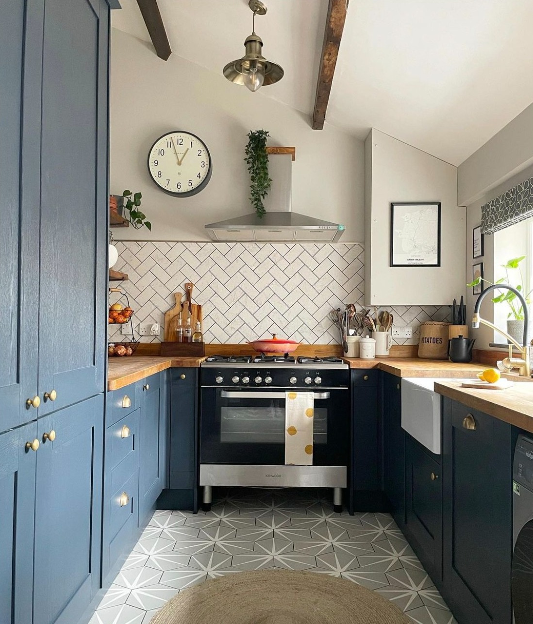
Image via Instagram by @sophia.at.home
Cornforth White works beautifully in this kitchen design by @sophia.at.home. Navy blue kitchen cabinets and solid wood worktops give the space a relaxed feel, while the grey and white hexagonal star floor tiles and marble wall tiles add a touch of modern flair. This is a wonderful design that would work just as well in a new build as it would in a period home.
Cornforth White Bedroom
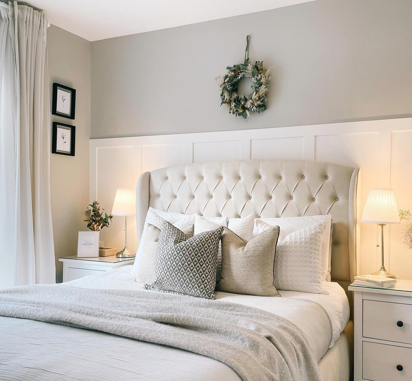
Image by @reynoldsresidence
Cornforth white has been used on the walls in this bedroom to create a space that’s both calming and elegant. The panelling has been painted in pure white, which helps the Cornforth White stand out. The upholstered headboard is almost the same shade as the walls, which helps tie everything together perfectly.
Farrow and Ball Cornforth White Kitchen Cabinets
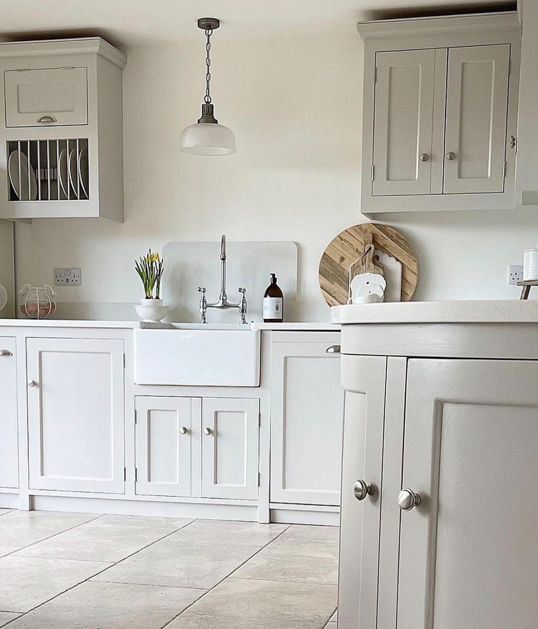
Design by @thepannellhome
This dreamy kitchen design features solid wood shaker cabinets painted in Farrow and Ball Cornforth White. As you can see, the soft grey colour compliments the stone floors perfectly, creating a very soothing space.
Master Bedroom Painted in Cornforth White Farrow and Ball
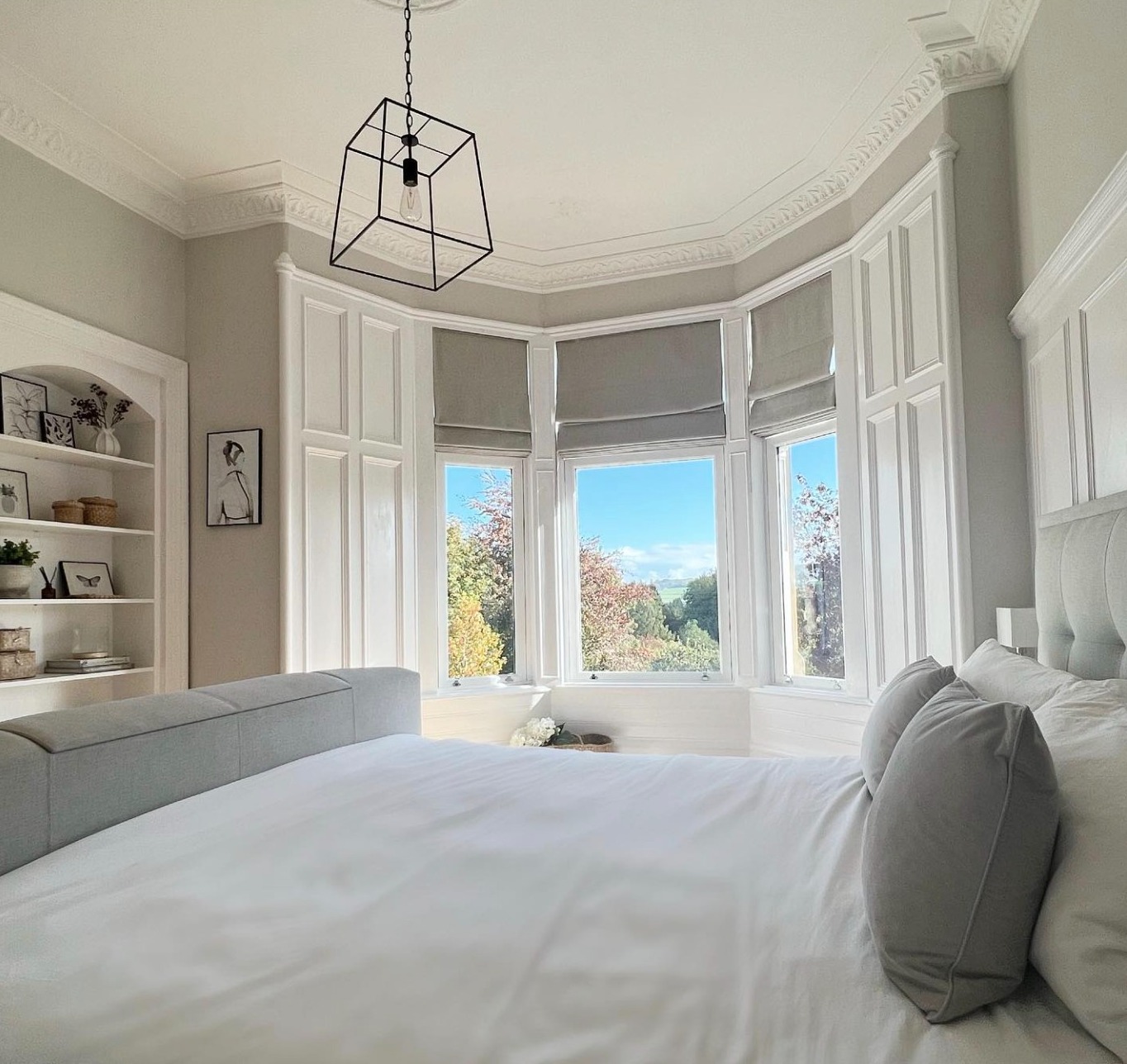
Design by @lisa.home_
This beautiful master bedroom has been painted in a Cornforth White colour match, with the paneling and trim painted in pure white. This contrast between the white and Cornforth White adds a beautiful depth to the space, whilst keeping it looking bright and airy.
Kids’ Bedroom Painted in Farrow and Ball’s Cornforth White
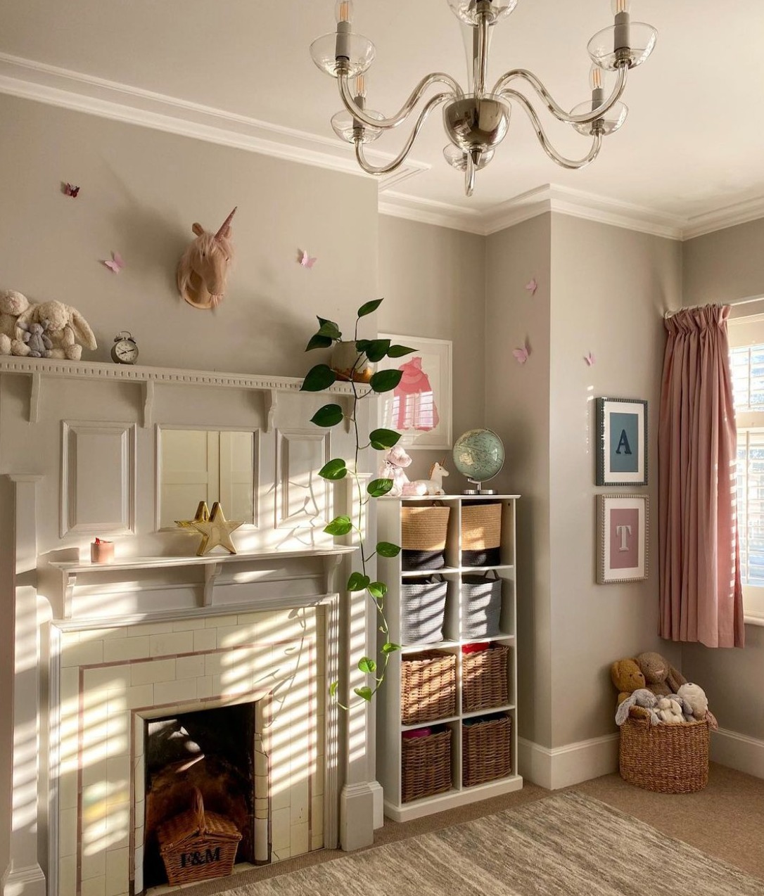
Designed by Isabelle – Le Home Le House
If you’ve been thinking about using Cornforth White in a kid’s room, this is a great example of how it can be done. The pink accents add warmth, creating a space that feels welcoming and comforting.
Cornforth White Hallway
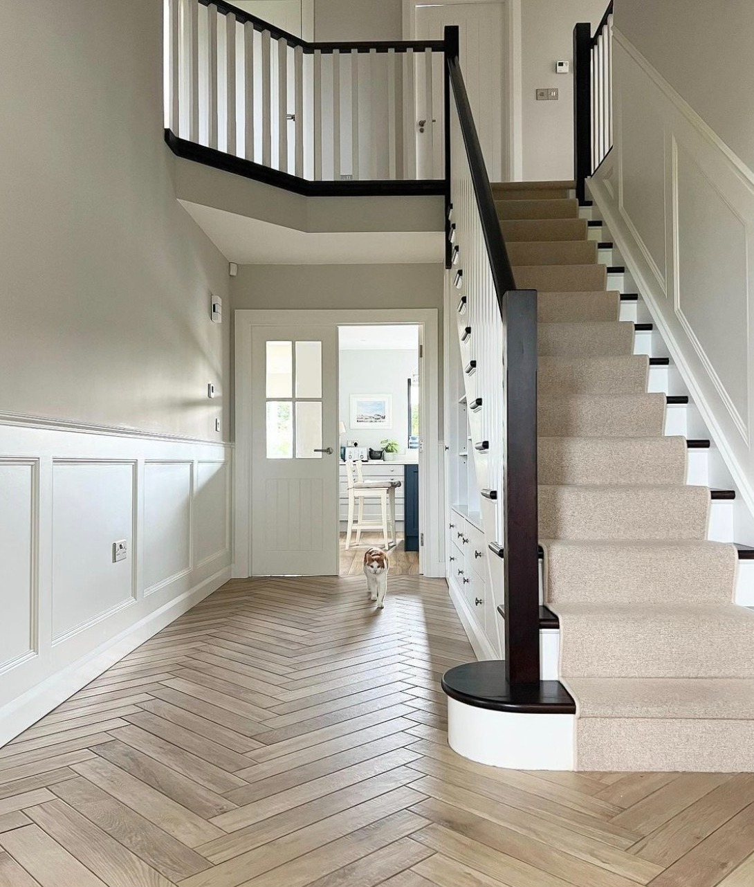
Interior Design by Leigh-Ann from @theslievehome
Cornforth White is a great choice for hallways and entryways. Here, it has been used on the walls above the white paneling, and it works beautifully. The back accents create a stark contrast, while the herringbone floor adds texture and interest to the space, creating a simple but well-balanced look.
If you’re thinking of painting your banisters in a darker colour, like the image above, then try Farrow and Ball Railings. This stunning colour works beautifully with Cornforth white to create a high-contrast yet timeless look.
Cornforth White Living Room
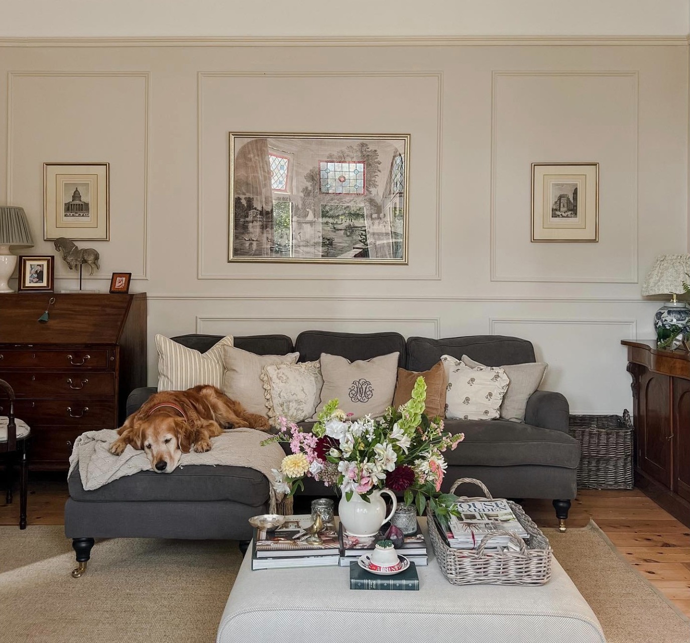
Interior design by Victoria from Tale Victoria
Cornforth white is a wonderful choice for living rooms. As you can see here in this beautiful living room design by Victoria from Tale Victoria, it looks fantastic on the paneled walls in this period home. It’s an ideal colour for creating a space that feels both bright and airy yet warm and welcoming. It’s easy to see why it’s such a popular choice for living rooms.
Is Cornforth White Grey or Beige?
Cornforth White is a warm light grey colour. It has warmer tones than most greys, so in certain lights, it can look like a light beige.
Colours That Go With Cornforth White
If you’re looking for colours that will work, you will be pleased to know that there are quite a few good options to choose from.
For trim, lighter shades of white often work well. You can go wrong with Farrow and Ball’s All White—a pure, bright white. This will help to keep your space looking bright and airy, while allowing the warmer tones in Cornforth White to stand out. Unlike a brilliant white, ‘All White’ only contains white pigments, so you won’t see any of the coldness that can come with Pure Brilliant White paint.
Another good choice for trim is Wevet. This delicate white is clean and understated with just a slight hint of grey. It can be used on trim, woodwork, and ceilings alongside Cornforth white to create a relaxing and soothing colour scheme.
If you’re looking for an Accent colour to pair with Cornforth White, Ammonite is a great choice. It’s just a shade lighter than Cornforth White, so it’s a good choice for using as an accent colour on any darker walls in your rooms to keep your space feeling light and inviting. Check out these examples of how to use Farrow and Ball Ammonite in your home.
If you’re looking for a darker colour to pair with Cornforth White to create some contrast, then both Down Pipe and Railings will work well.
Farrow and Ball’s Railings, in particular, is a great choice for using as an accent on staircases, banisters, radiators, and even kitchen units. This two-colour combination is perfect for creating a sophisticated, timeless look.
Does Cornforth White Look Purple?
Although Cornforth White has slight lilac undertones, it rarely actually looks purple. In warmer light, it can look almost beige, while in cooler lights, it’s a definite grey.
Because it can vary so much depending on the light, I would definitely recommend ordering a sample pot and testing it on different walls in your room before making a decision. You can order sample pots and a free colour card here.
What Colour Flooring Goes With Cornforth White?
Cornforth White looks great against neutral-coloured and natural wood flooring. This is because the warm tones of natural wood help complement the undertones of the colour.
Testing The Colour On Your Walls
It’s really important to test the colour on your walls before buying the paint for your entire room. This is because, in darker rooms with less natural light, Cornforth White will look more grey. While in other spaces—south westerly facing rooms, for example—it will look much brighter, and can even look beige in warmer lights.
You can buy small tester pots from Farrow and Ball’s website. This will allows you to see how the colour really looks once it is on the walls in your room. I would recommend painting a large swatch on each of your walls, so you can see how it looks as the light hits it at different angles. As the light can change throughout the day, remember to have a look at how it looks in both the morning and evening light.
Cornforth White Dulux Alternative
If you’re looking for a Dulux alternative to Cornforth White, try Quartz Grey from the Dulux Heritage range. It’s a very close match and is a great option for anyone on a budget who doesn’t want to pay the Farrow and Ball price tag.
You may also want to try Pebble Shore by Dulux. This is a lovely soft grey with no blue or lilac undertones.
If you’re trying to choose between Farrow and Ball and Dulux, you might find this article helpful: Farrow and Ball vs Dulux.
Choosing the Perfect Paint Finish
Farrow and Ball paints come in a variety of finishes, so whatever your project, you will be able to find a finish that suits it perfectly.
The options are:
- Modern Emulsion
- Estate Emulsion
- Modern Eggshell
- Estate Eggshell
- Full Gloss
- Exterior Eggshell
- Exterior Masonry
As you can see, there are plenty of finishes to choose from! Modern Emulsion and Estate Emulsion are both for interior walls, but they have slightly different finishes.
Estate Emulsion has a deliciously matt finish, which has a unique ability to hide imperfections on walls. It’s a popular choice for master bedrooms and living rooms, but it does mark easily. Once you have badly marked Estate emulsion paint, it isn’t easy to touch up, and most people end up re-painting the whole wall.
Modern Emulsion is the best choice for busy households with pets and kids. Although it’s not super matt like Estate Emulsion, it still has an amazing finish to it and is completely wipable. It’s also really easy to touch up if you need to, which is a bonus.
If you’re painting interior woodwork, you will want to choose one of the eggshell finishes. These have a slight sheen to them, and are more resistant to knocks and bumps, making them the ideal finish for doors, woodwork, and trim.
Farrow and Ball also offer a range of specialish finishes too, including Casein Distemper and Soft Distemper. These are an ideal choice for older houses with historical features, stone walls, and period plasterwork.
Where Can I Buy Farrow and Ball Colour Charts?
You can get a Farrow and Ball colour chart here, it’s completely free!If you’re just getting started in Interior Design, or if you’re planning on taking on more renovation projects, check out my article on the best interior design books for beginners for more inspiration!
Leave a Reply