
Hot off the runway and straight into the interior design scene struts a bold new trend called colour drenching. And colour is where it’s at!
Throw away all thoughts of traditional white ceilings and contrasting woodwork. Coordination, complementary shades and sweeping blocks of colour are key. With its daring colour fusions, colour drenching has the power to transform any room. But what does it involve?
What exactly is colour drenching in interior design?
Born on the SS20 fashion runways, this trend has now made itself a home in DIY and interior design circles.
At its very simplest, colour drenching is the process of painting an interior in a single shade, or very few. One colour everywhere – floors, ceilings, woodwork are all cloaked in your paint of choice, turning your home into a contemporary canvas.
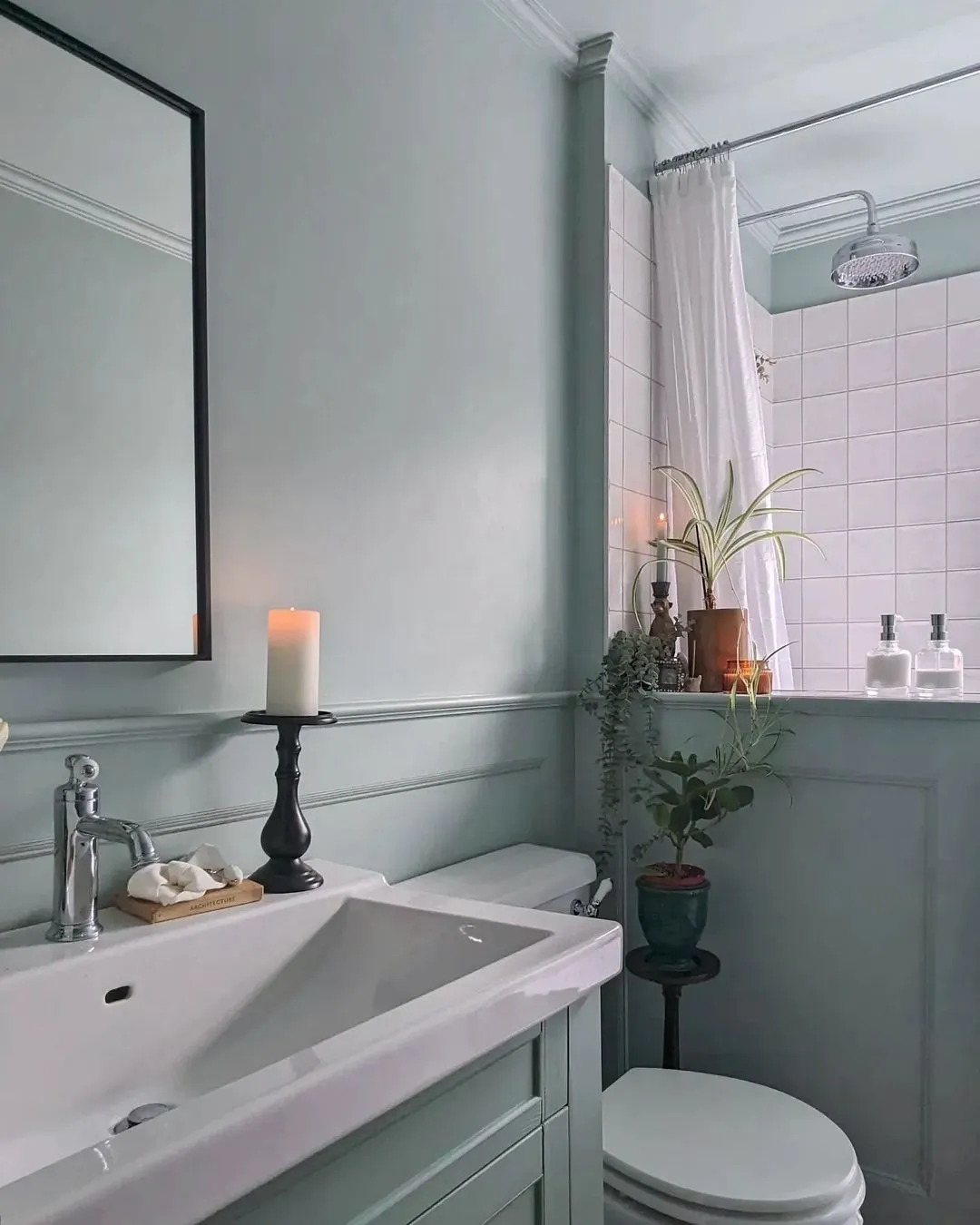
Image credit: @chateau.simps
Why you should add colour drenching to your DIY repertoire
There are many reasons why introducing colour drenching into your home might pique your interest, but here are just a few to mull over:
- It opens up space
- Keeps your eye away from corners
- Creates a comfy cocooning effect
- Gives a contemporary vibe
- Spotlights your furniture
Where to start with colour drenching
On planning your space
Colour drenching is seriously transformative, and requires serious planning. If you’re working with a bland and featureless space, think of ways you can mix in drama and mystique.
Conversely, if your room is blessed with beautiful features such as crown moulding or beams, consider how you can emphasise them without overwhelming the design. Often this comes down to your choice of colour palette and how the light falls in your space.
On picking a colour (or group of colours)
Neutrals and muted tones
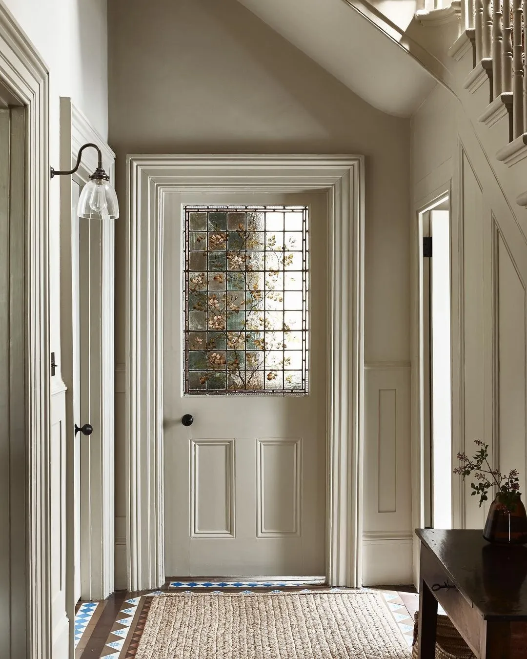
Image credit: Little Greene
Neutrals are restful and stress-busting. With a variety of undertones at their disposal, they can freshen up a space and create an enveloping haven by blurring stark lines and promoting a sense of depth – see how Little Greene’s Portland Stone opens up this beautiful foyer.
Warm shades
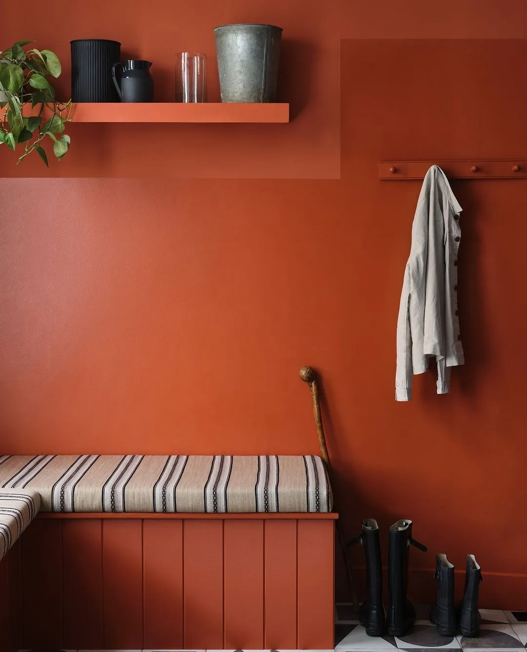
Image credit: Paper and Paint Library
Reds, pinks and oranges are an exciting way to introduce warmth into the most neglected and pokiest of corners. While warm colours might overwhelm as a feature wall, allowing them to creep slowly up a room creates a sense of cohesion and intrigue.
Loud colours
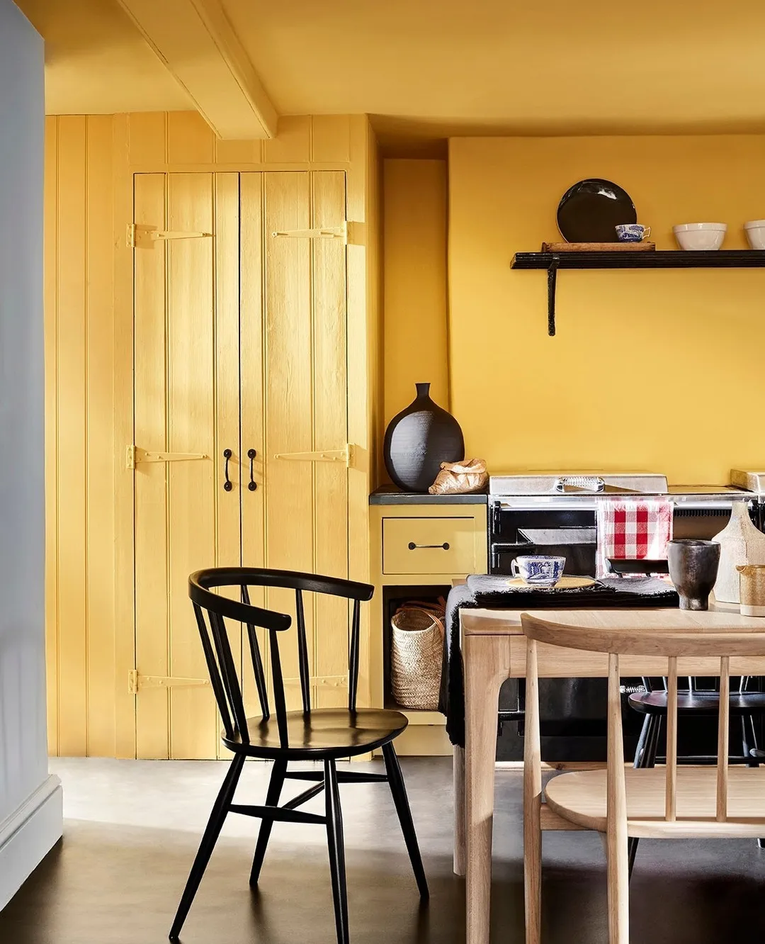
Image credit: Little Greene
Sometimes you need a colour that goes the extra mile to inject a little joy into a tired space, something that enriches your home and adds a hint of playful charm.
Bold, saturated hues such as Little Greens’ Giallo have no lack of character, and when introduced to rustic furniture, give off sunny vibes that’ll have you thinking of poolside holidays.
Obviously, this is an undertaking for the bolder DIYer, but if you don’t want to commit to the full shebang, another option is to gradually drench your interior with muted versions of these perky hues and then paint one feature such as a fireplace in a brighter shade. This way, your backdrop will feel more natural, allowing your chosen centrepiece to POP.
On achieving a cohesive look
Make sure you pick a group of complementary colours that will enable your furniture to sing. We’re aiming for interior eye candy here. Allow radiators, skirting boards, doors and window frames all to fade into the backdrop and see your room transformed into a cleaner, harmonious space.
If you’re working with a single paint colour and feel concerned about the space looking too sparse, layering in textures offers a handy opportunity to balance that out. From soft furnishings to an array of accessories, you can go as maximal as you want to build depth.
On styling colour drenched interiors
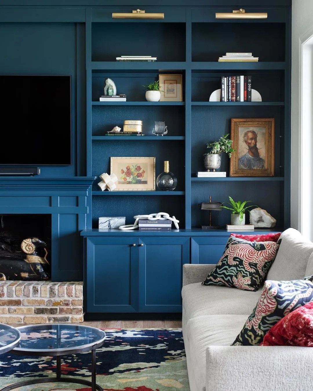
Image credit: Farrow and Ball
Complementary accessories and furnishings
When it comes to colour drenching in interior design, don’t let anyone tell you less is more. More is more! Don’t miss out any furnishings that you could pull into your overall scheme.
Consider these disappearing bookshelves and fireplace: if the room is small, this will help divert from both vertically and horizontally challenged spaces by drawing your eye further back and away from corners.
This receding effect is more dramatic with deeper colours such as Farrow and Ball’s Hague Blue, but the same can be achieved with paler shades such as their Tallow or Jitney. Natural grey-green tones work especially well in bedrooms and living rooms with their mix of elegance and botanical energy.
Accents and period features
As with furnishings, don’t neglect to incorporate features such as inbuilt shelving, cabinetry, radiators and fireplaces into your colour scheme. These could either be stand-out accents or subtle features that blur into the background.
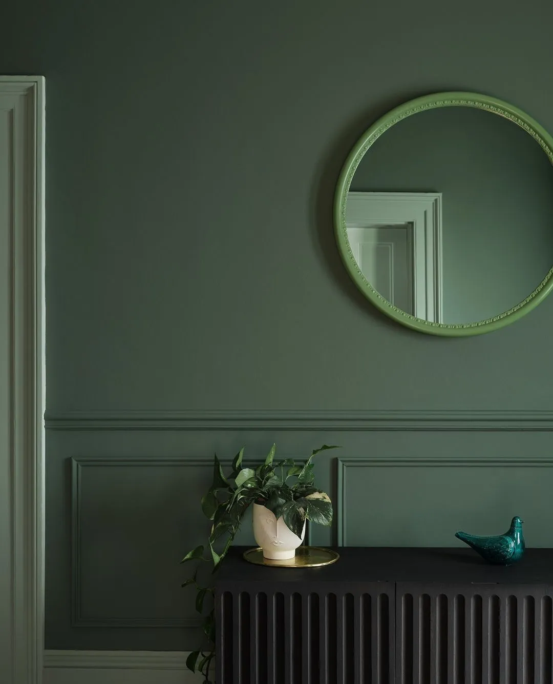
Image credit: Paper and Paint Library
Go bold or go home
Phew! That was a lot of information – I hope you managed to glean some useful insights from this post to use for your own DIY projects. If there’s one thing you should take away with you, it’s that with colour drenching bold = beautiful.
Select your favourite shade and paint the room from head to toe: ceiling, walls, chimney breasts, skirting, window frames, yep, the whole lot. And don’t let anything hold you back!

What color would you paint the front door? I have brown/tan brick with dark gray running through the bricks. I painted the exterior trim in a dark gray but can’t figure out what color to paint the front door. Any ideas?
Hi Jodie,
Thanks for your comment! It’s hard to tell without seeing a photo of your house, but from your description, I would probably recommend a green-grey colour like Pigeon by Farrow and Ball .
I hope this helps but feel free to reach out if you would like to share pictures or ask any questions 🙂
Best wishes,
Emily
Do you know where I can get this door from please? Thanks
Hi Kellie,
You can find similar Victorian stained glass doors at https://www.thestainedglassdoorscompany.com/categories/antique-stained-glass-doors
I hope this helps!
Best wishes,
Emily
Hi Emily
How inspiring. Do you know the neutral color used for the foyer? (Neutrals Little Greene’s Portland Stone picture). Do you know where I cam get more inspiration on Colordrenching of small entryways and long, dark corridors whithout any daylight? I struggle with those rooms 🙂
Thanks a lot.
Best
Julie